Paid Collaboration with Tile Giant
Tile Giant Victoria Baths Collection
I was recently asked to design moodboards for Tile Giant’s new collection that has been inspired by Manchester’s Victoria Baths. This is an institution in Manchester and I was keen to get involved with the fabulous new range. All tiles are Edwardian in style with traditional undertones but the vibrant colours make them ideal for any modern day home.
Art Deco Inspired Bathroom Moodboard
First up I chose the Crackle Bevel Vintage Green tile because I felt it was the most iconic representation of Victoria Baths. The vivid green tiles cover the changing rooms and the stairways in the 1906 building, making them the perfect tile for a bathroom moodboard.
Victoria Baths, picture via Trip Advisor
Inspired by this Divine Savages image below, I went with a nod towards Art Deco with the Crackle Bevel Vintage Green metro tile. Combining with a statement wallpaper like this Gatsby Gold Geometric Metallic Wallpaper from B&Q and adding accents of brass accessories that pop against the deep greens, it would look perfect in a small bathroom or cloakroom.
Divine Savages - Deco Martini 'Arsenic'
The tile would also work equally well as a kitchen backsplash as seen here in this gorgeous Devol Kitchen showroom. That is why I added in Farrow & Ball’s Sulking Room Pink to my moodboard because the pink instantly gives a fresher feel to the scheme.
Image Via Devol kitchens
Don’t forget the bee print which is symbolic of Manchester history, past and present!
Bathroom flatlay using Crackle Bevel Vintage Green tile
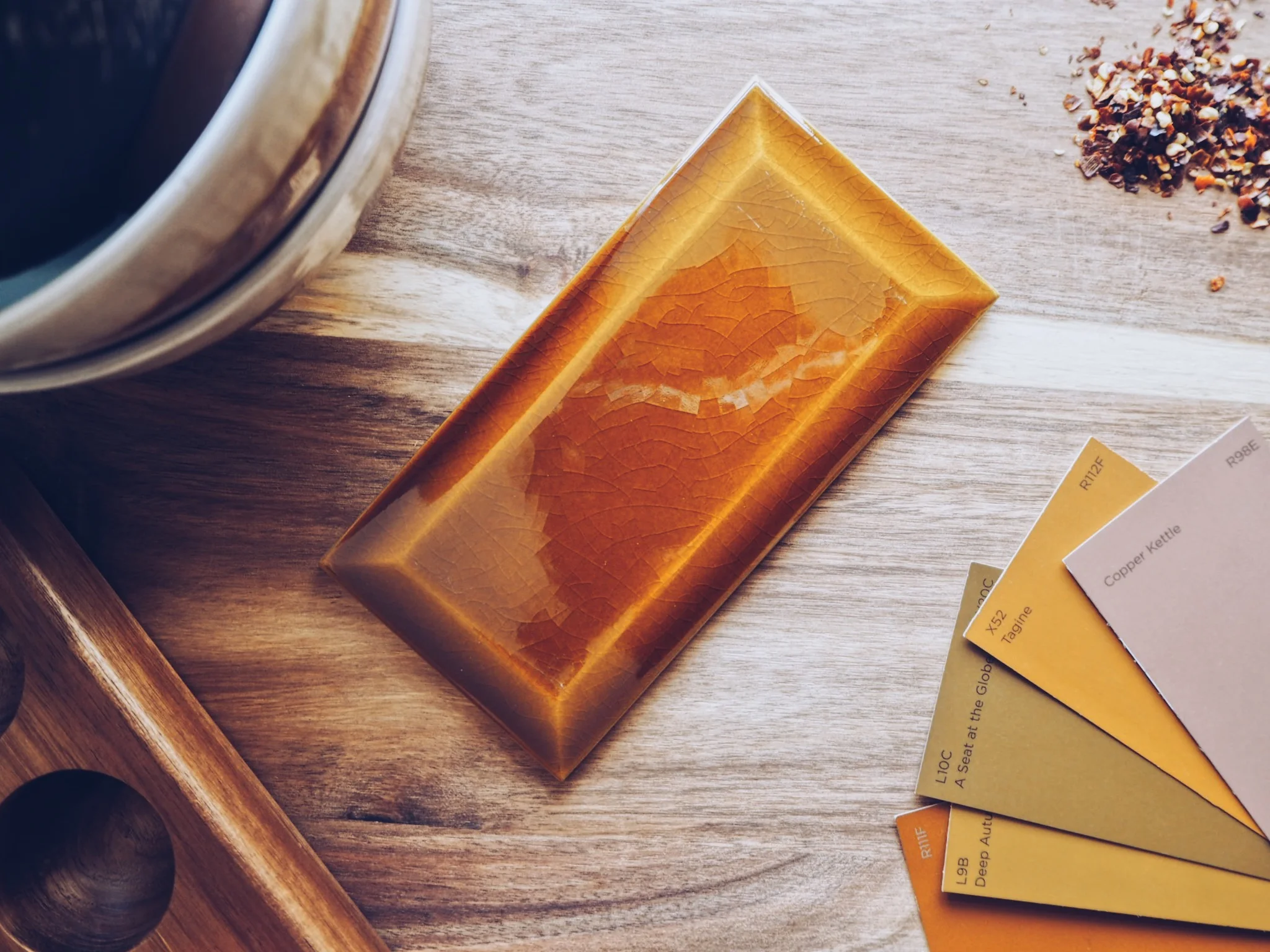
Next up I chose the Crackle Bevel Mustard tile because of my love of all things linked to the current New Neutral trend. You can read all about the trend here in my previous blog post. I decided to use this in a kitchen environment with lots of rich wood tones and hand painted ceramics. Think warm and spicy colours - this colour palette is definitely enjoying a moment in the spotlight this year and I am fully embracing it.
New Neutrals inspired flatlay
Victoria Baths, Manchester. Photo via INews
Close up detail
Lastly I chose to style the Victoria Baths Terrazzo Floor tile in line with the Maximalist trend of 2019. This is all about embracing your personality and clashing prints and colours. I picked up a lot of wallpaper samples on my travels whilst prop shopping and was pleasantly surprised at how well this Trellis Navy Metallic Wallpaper went with the terrazzo. Picking up on the terracotta tones of the tile, adding in pots and candles bring the scheme to life. Farrow & Ball’s Preference Red also adds another dimension to the moodboard and can be used in small doses to create that “purposeful clash”.
Maximalist inspired moodboard
I also added in a Lowry postcard which I think works perfectly here as another nod to the Manchester heritage.
Close up details
I hope this has inspired you to go and check out the collection at Tile Giant - there are loads more gorgeous colours and designs in this range.


