home

How To Create A Safari Inspired Nursery

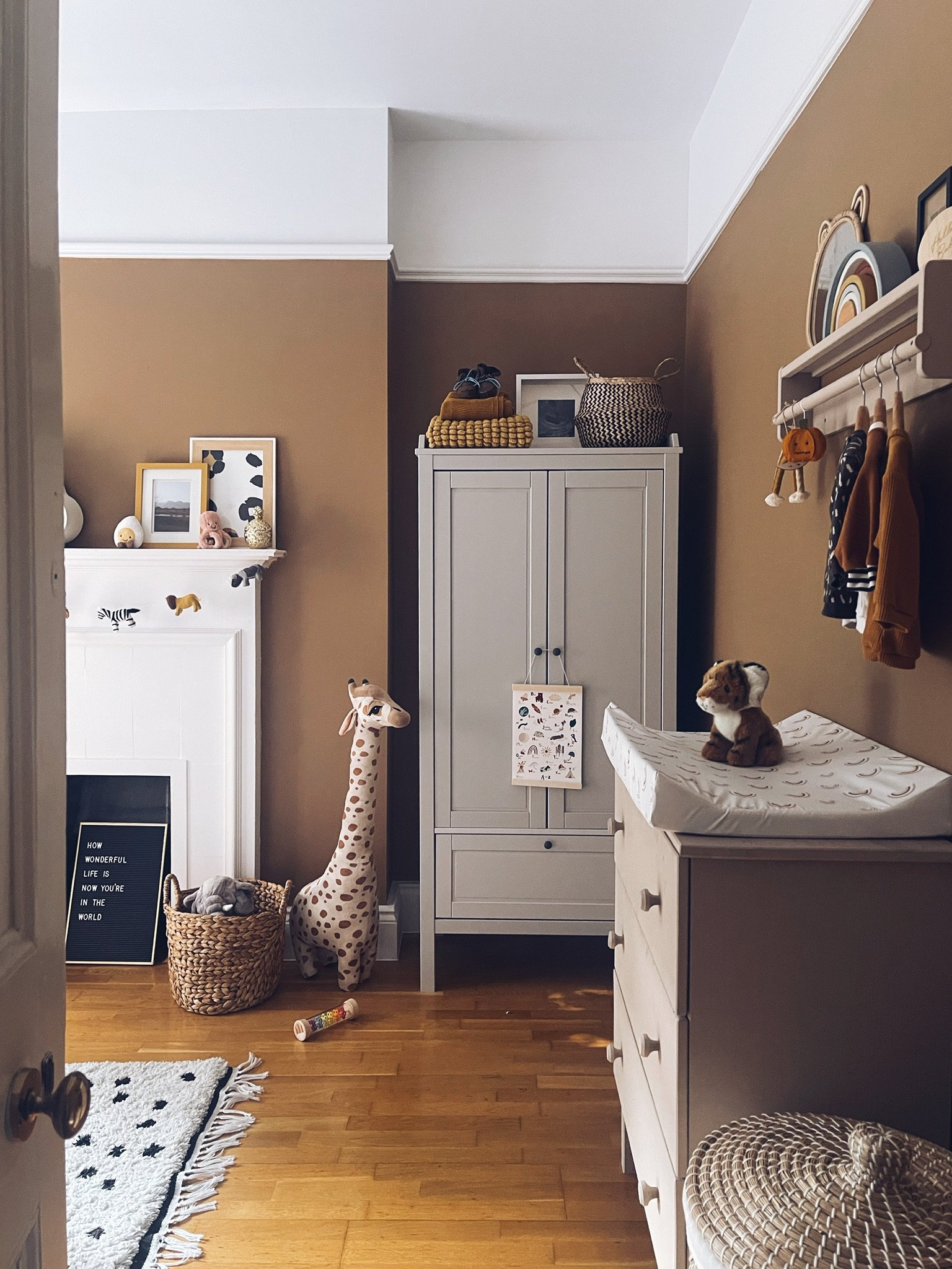
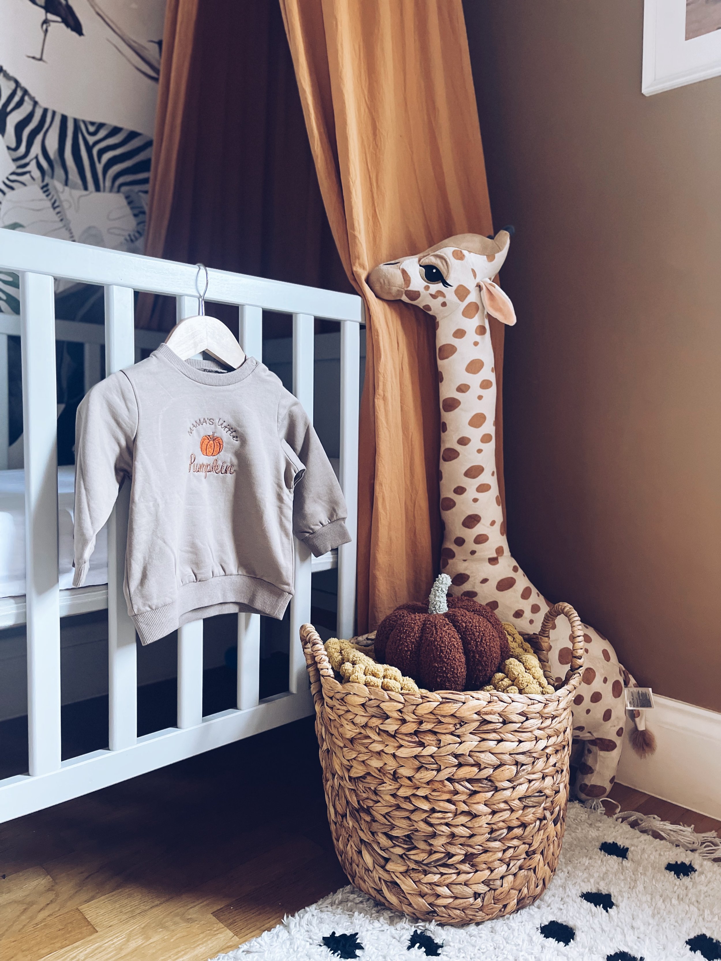
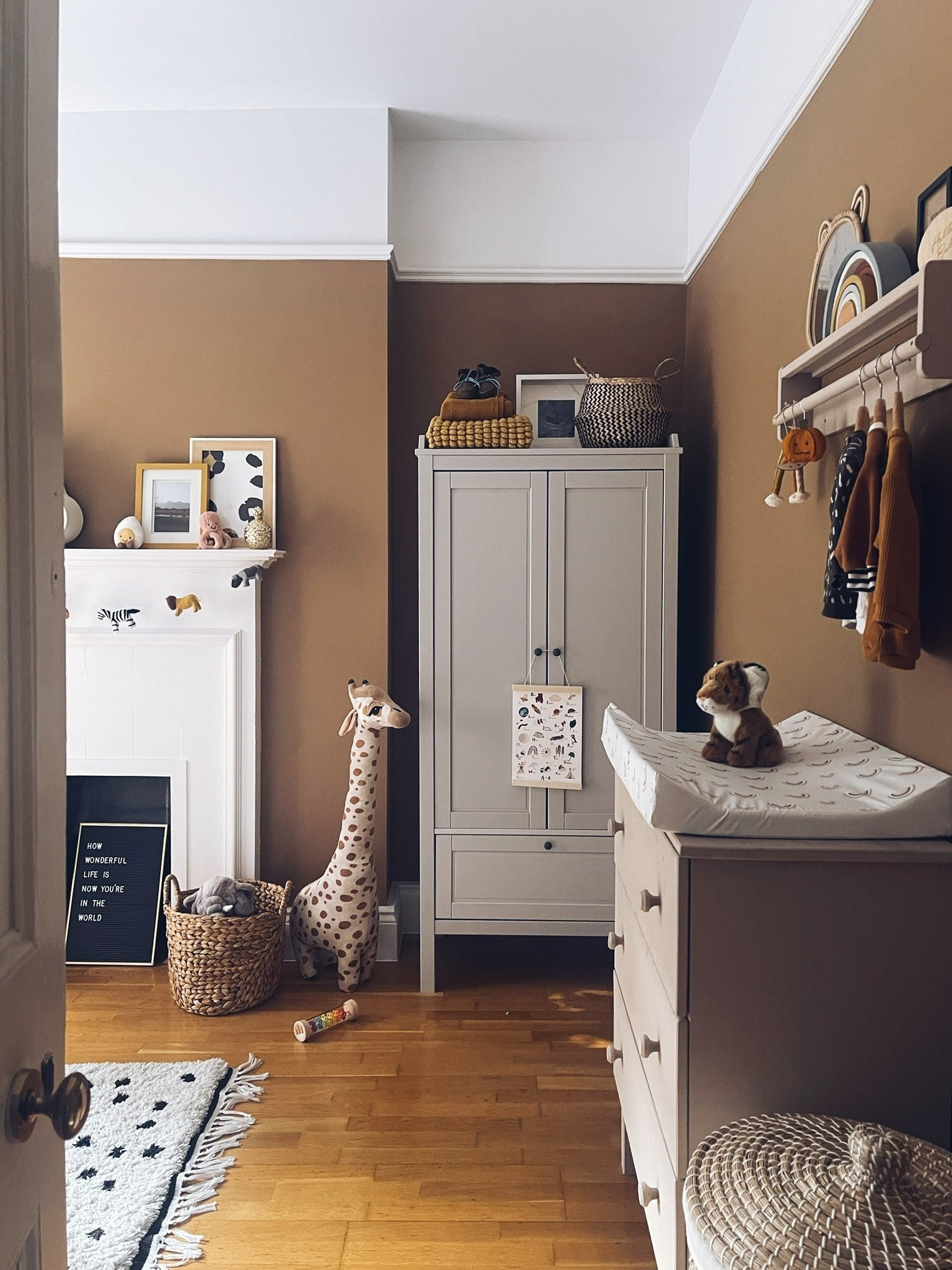
Our baby boy is now 8 months old but I have finally gotten round to writing about how I pulled together his nursery. It was one of my favourite rooms to create and actually the only room we’ve painted ourselves (shock horror I know!).

Those last months of pregnancy are filled with so much anticipation, excitement, nervousness and let’s face it - boredom. This room was the perfect distraction and we have filled it with so much love. Yes it’s true, they don’t sleep in here for the first 6 months and maybe you won’t use it very much but it was a safe space for us and has fast become our favourite place to hang out in.

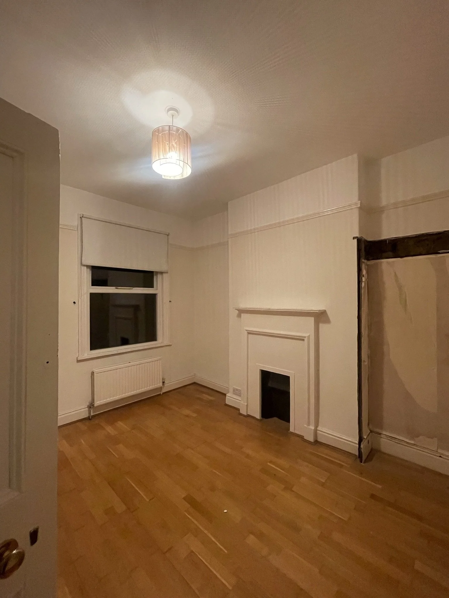
The room was previously used as a dressing room/dumping ground and we’d left it exactly the same as when we moved in. There is a lovely big sash window and a gorgeous fireplace which we wanted to keep but the rest of the room was stripped back to brick, re-plastered and repainted. Probably wasn’t the wisest of ideas to have it done at 8 month pregnant straight after the kitchen reno but hey, we survived. There were a few crazy pregnant lady episodes but it was all worth it in the end.

The room is right next to the master bedroom so was perfectly placed to become the nursery. It is a nice spacious room and I know he is one lucky little boy to have this as his bedroom. That’s one of the things that drew us to this house - the space and the original features.

The floorplan. Bedroom 2 is the Nursery.

I always knew I wanted a Safari themed nursery when we found out we were pregnant, having been on Safari for our honeymoon but mainly because I am obsessed with the colour Spiced Honey. See blog posts from way back in early 2019! I’m not a fan of the baby blue and baby pink colours for babies and I have an aversion to the muted yellows too. So this Safari theme with the base colour of Spiced Honey, which does exactly what it says on the tin, came together really quickly for me.

The Moodboard

The Colour

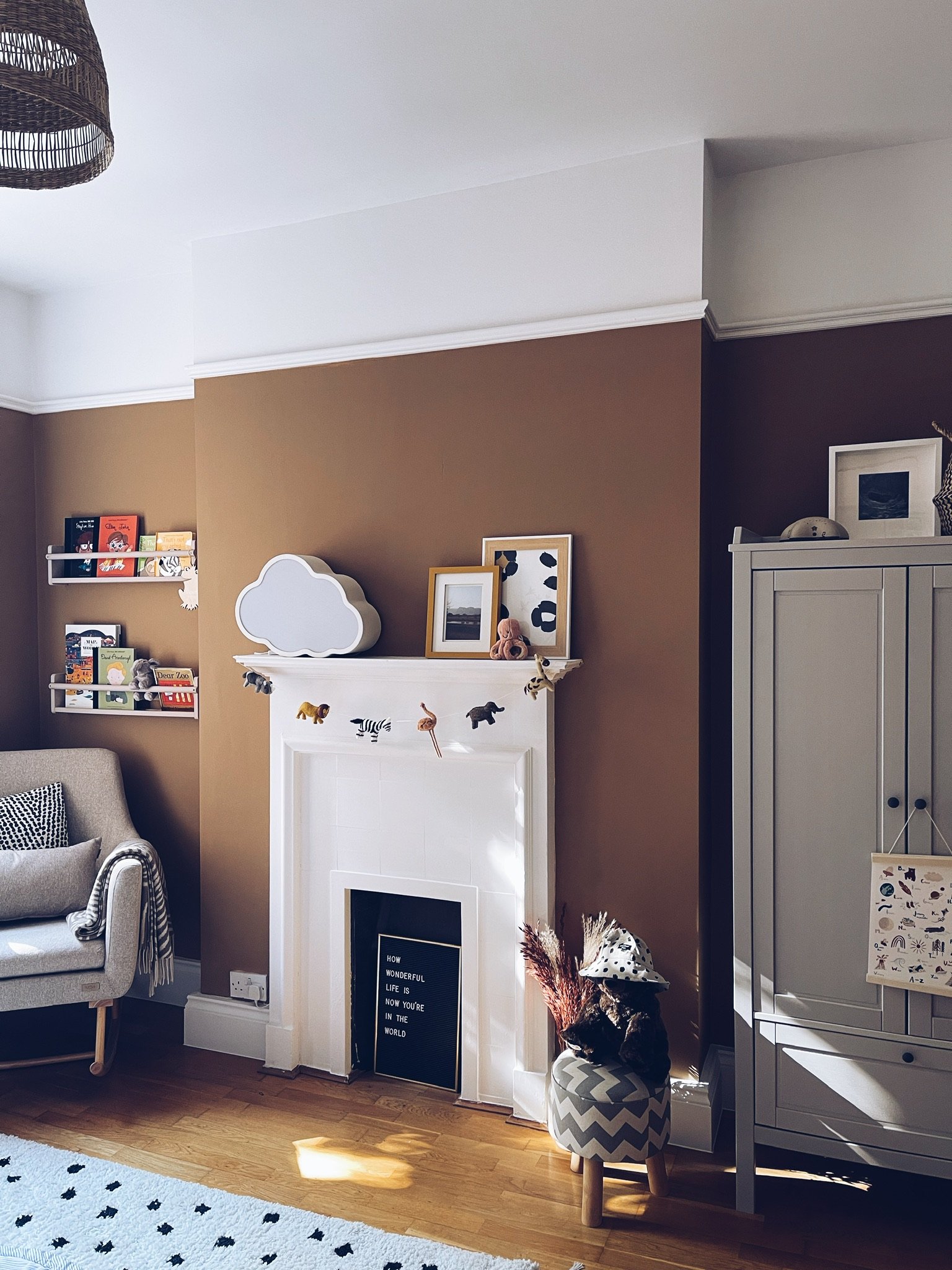
I can’t tell you how much I love this colour. It’s so warm and inviting whilst being the perfect neutral for the rest of the room. We decided to paint up to the picture rail in this room and keep the ceiling white. You all know how much I love painting a ceiling but I wanted to let the Spiced Honey shine.

Quick Insider Tip

Did you know that on the Dulux website, they marry colours up so you don’t have to? You can create the perfect palette without spending hours and pounds in the B&Q aisle.

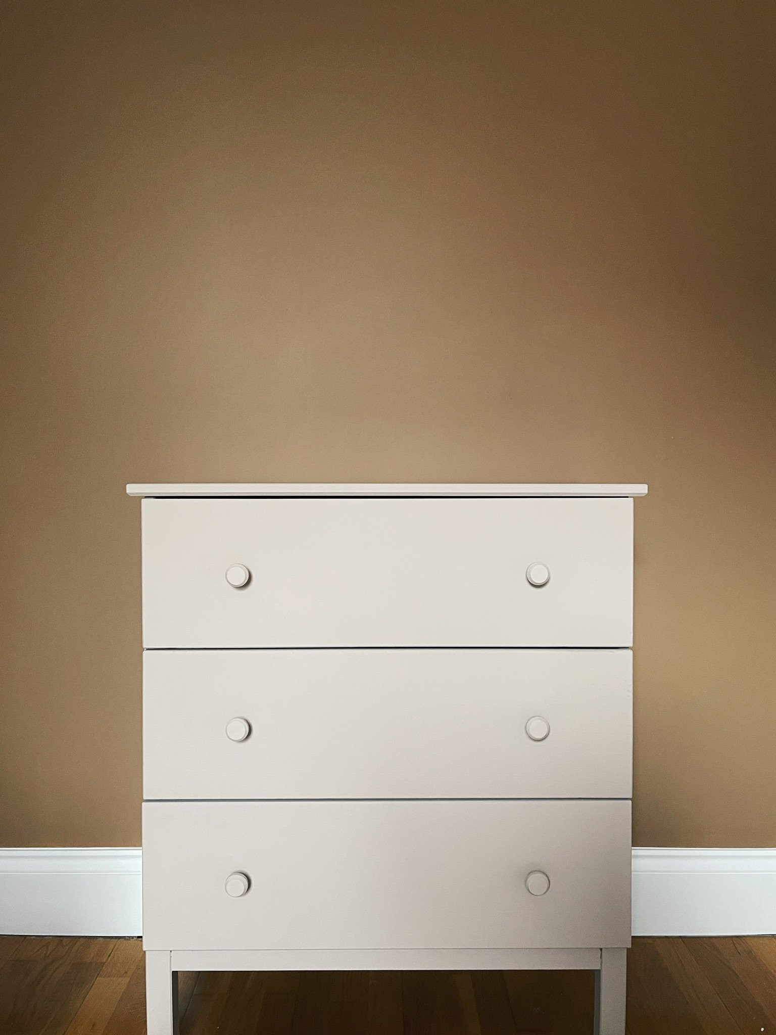
Spiced Honey was paired with White Mist and Muddy Puddle so that’s exactly what we did. White Mist went on the ceiling, skirting boards and fireplace. Muddy Puddle was introduced as an accent colour on bits of furniture. I upcycled our 8 year old Ikea chest of drawers (another first) after it had been used as a cat scratching post and dumping ground in our old bedroom. I love how this room has little touches of our blood, sweat and tears in it as well as whole lot of love.

The Mural

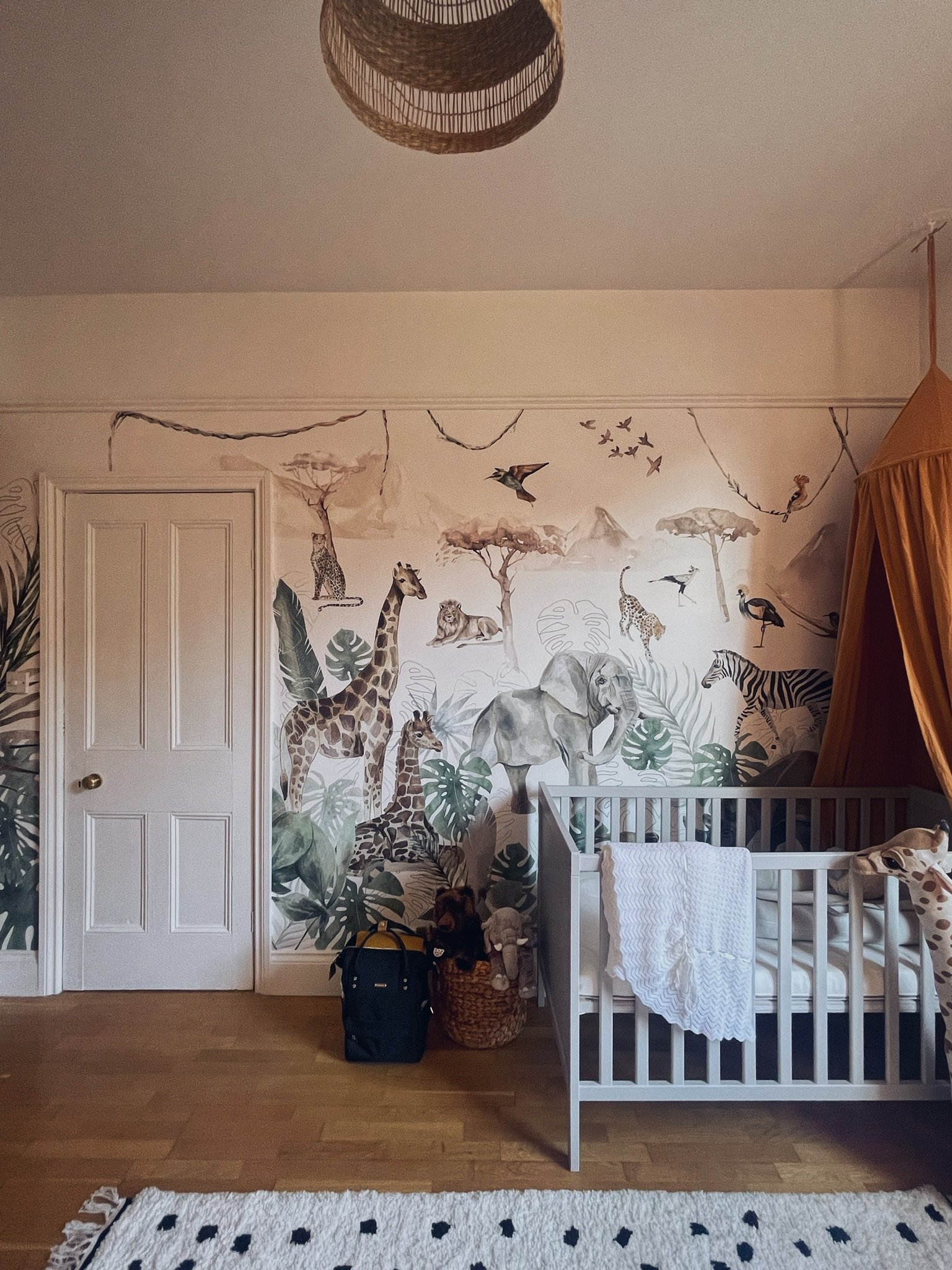
(AD) The next big thing I knew I wanted was a mural. If there’s anywhere a mural looks amazing, it’s in children’s decor so I contacted Munks & Me to work on a collaboration as I had admired their wallpapers for SO long. They do so many beautiful themes so you’re sure to find something for your little one even if Safari isn’t the one.

Paradise Jungle Wallpaper : Munks & Me

The best thing about Munks and Me is the customisation. Got a weird door in the middle of your wall? Or want to wallpaper around the window? Munks and Me will custom design the pattern for you so you don’t end up throwing away the good bits. All you need to do is send your measurements and they will come back with a mock up for you. If i’d just ordered from stock I would have lost the giraffes and let me tell you - the giraffes are Roman’s favourite!

This wallpaper is so beautiful, it brings a smile to both our faces everyday. It was also really easy to get on the wall and I have a feeling it’s going to be around for years to come.

The Details

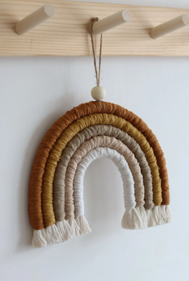
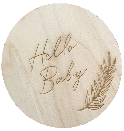
I adored bringing together all the little accessories in this room. My tip would be to combine big brands with small independent brands too. Etsy is your best friend for this kind of thing. I found so many local makers on there and I love the handmade element of it all. Instagram is also perfect for local makers - wall hangings, toys and clothes. Honestly I’m addicted. Those algorithm bots have got me good.

I also love bringing in personal touches like framed scan pictures and pictures from our honeymoon that will provide memories for years to come. As always my favourite places to get frames from are the cheap shops - Ikea, Wilkos and Dunelm.

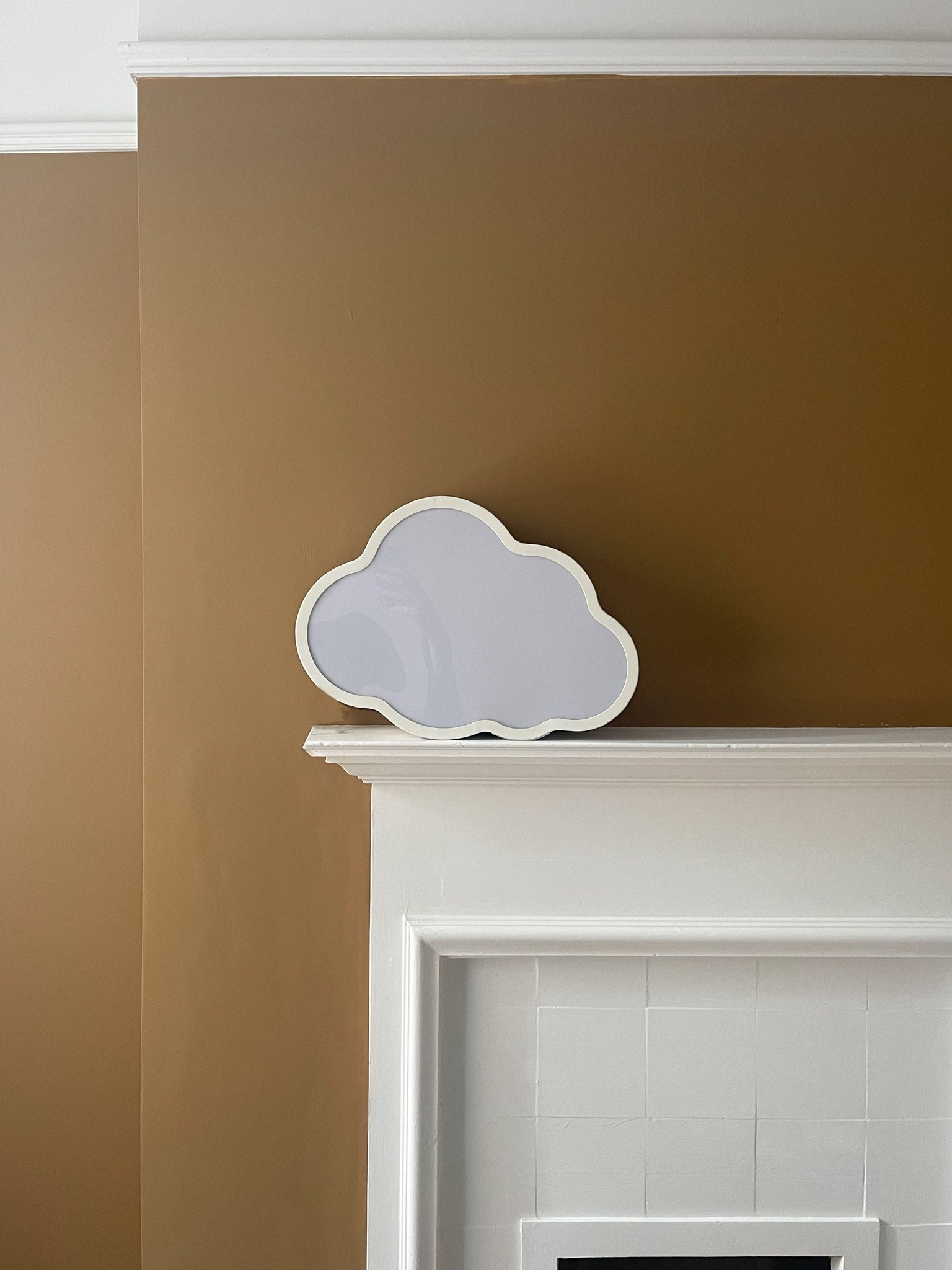
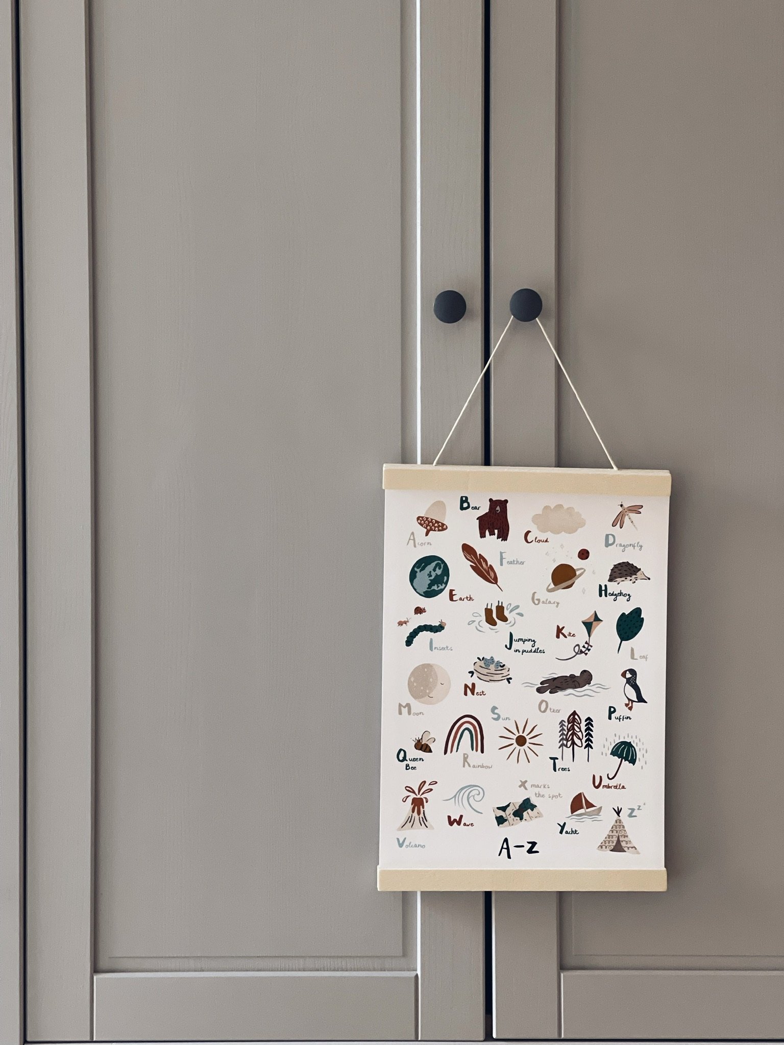
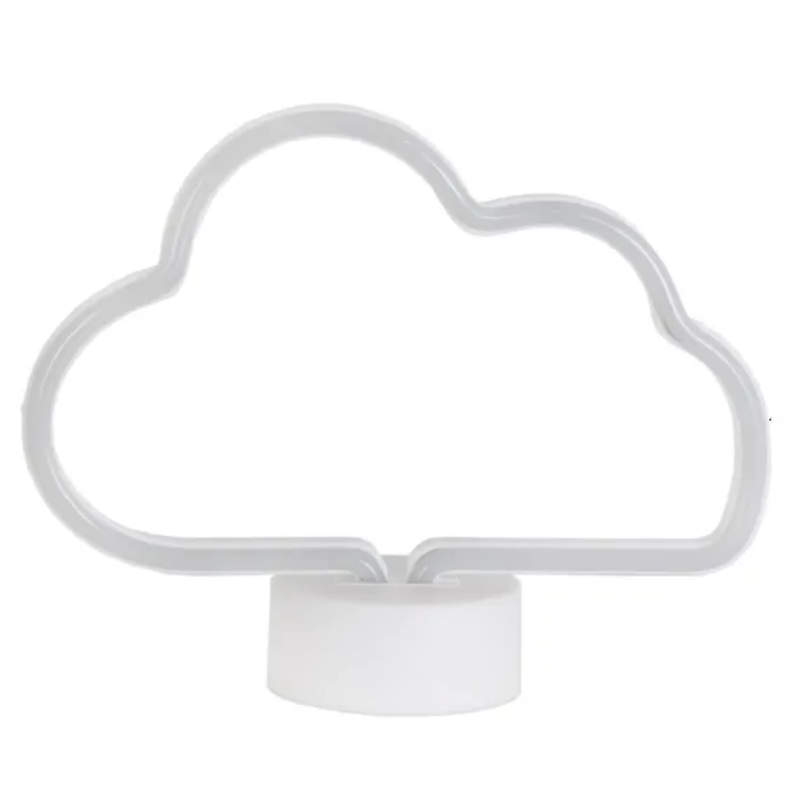
I also shopped the house which is another favourite thing to do and brought in prints from the living room and bedroom to finalise the scheme. We had the cloud light that I’d saved from years ago which works really well in here and the letterboard that I wrote my favourite Elton John lyric on.

Ikea Frames and personal photos.

The Blackout Roman blind was in collaboration with Loom & Last (AD) who create gorgeous made-to-measure curtains and blinds in stunning fabrics. I chose Porridge which as well as having an awesome name, has a beautiful weave and texture to it which adds more warmth to the space.

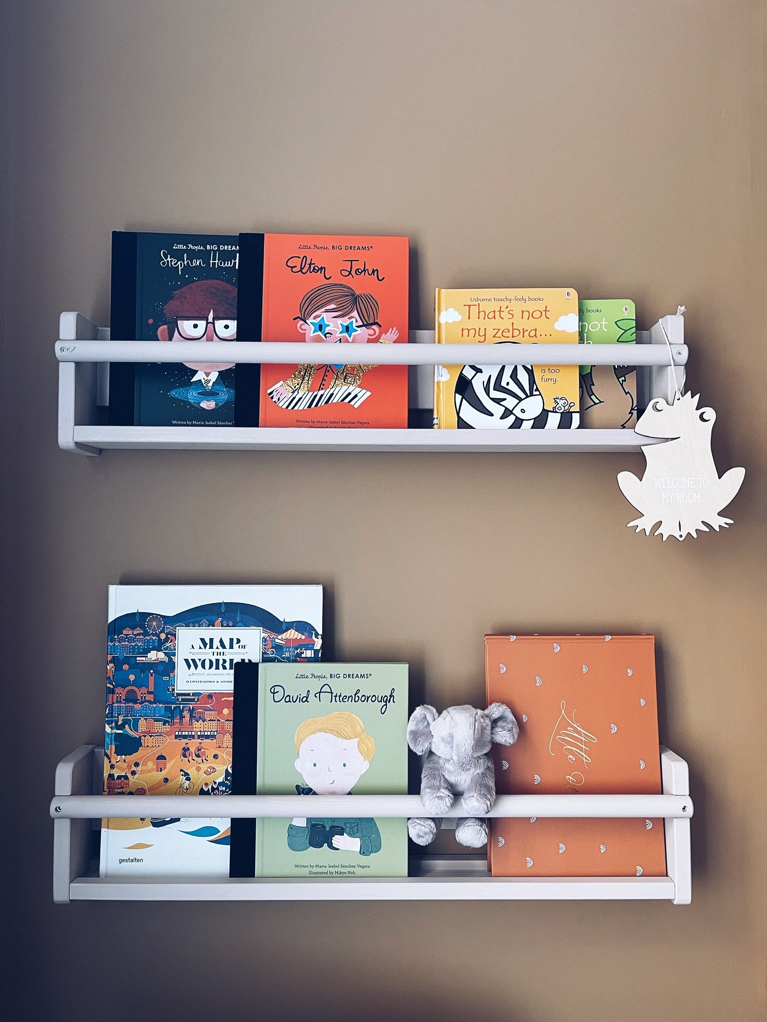
The “bookshelves” are Ikea spice racks painted in Muddy Puddle and turned upside down. This was an idea I’d seen on Pinterest and it is perfect. Although with the rate this little guy is collecting books, we’re going to need a lot more soon!

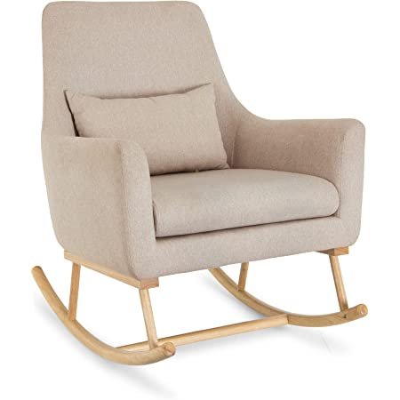
And finally the rocking chair which can be a contentious issue on whether or not it’s necessary. It definitely isn’t necessary but I love how it finished the whole room off. We are fortunate to have the space to accommodate it and I actually use it a lot. Maybe not in the early days but now it is used for night feeds and reading books. I remember so vividly sat in this chair every evening with just days to go before my due date, taking it all in and thinking about the future. It is a very special chair to me.

The Shopping List

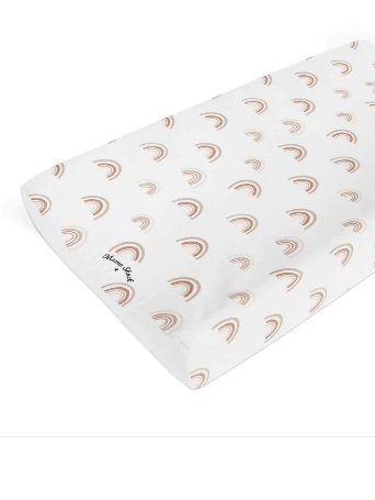
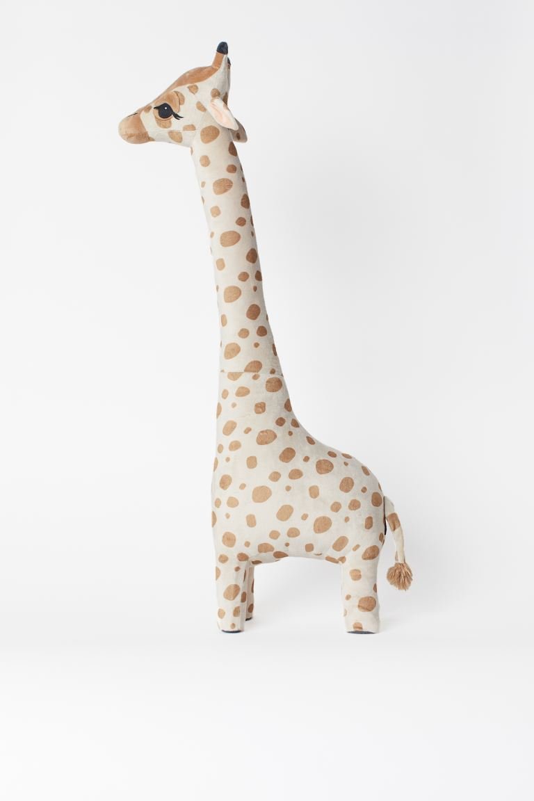
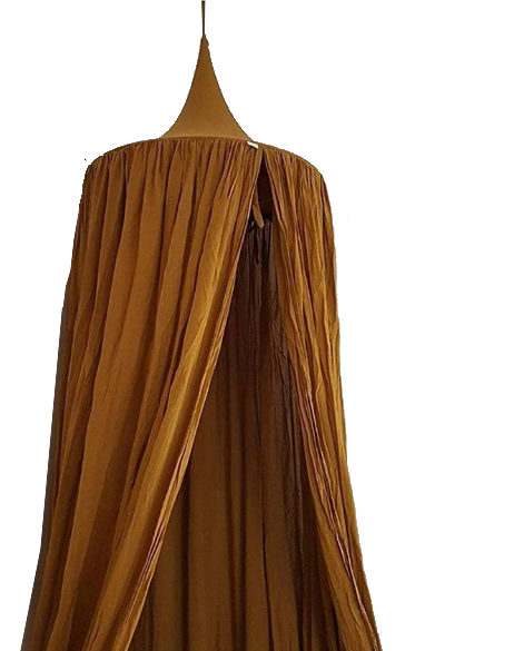
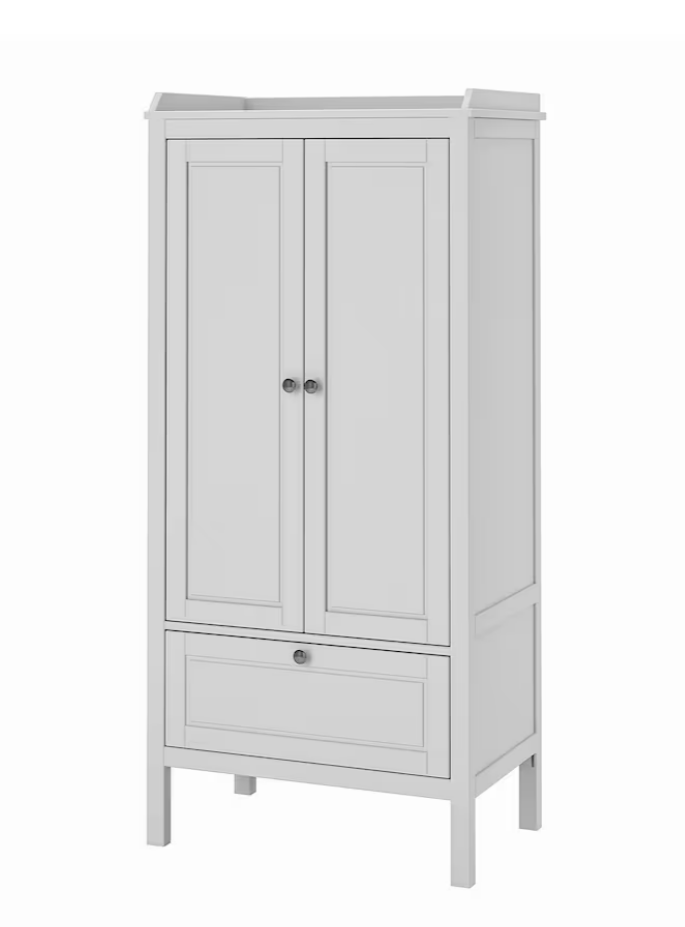
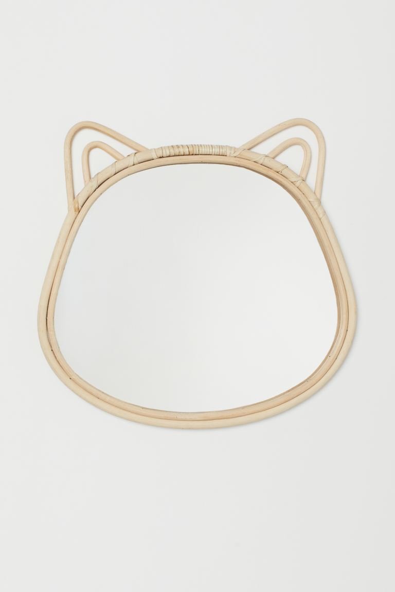
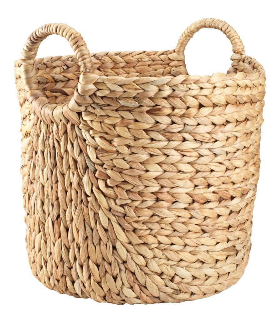
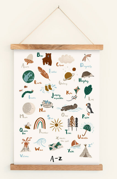
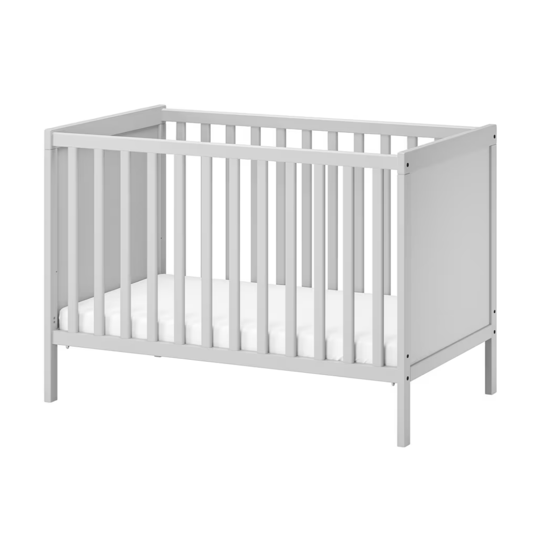
I’ve pulled together all the little accessories here. Some bits are similar as the originals seem to no longer be on sale.

Please note some links are affiliate (AD).

We actually spent a lot more time in here than maybe we thought. We have only just stopped using the changing station because he now wants to throw himself off it, we used the rocking chair for feeding and now use it for reading books. He learnt to roll, crawl and climb in here and everyday we say Good Morning to the animals on the wall so I’m soooo glad we created this space and I can’t wait to see it evolve as he does.

So there we have it - a Safari Inspired nursery. I’d love to know your thoughts so comment below or drop me a DM on Insta.
Giving Our Kitchen The Wow Factor

The Start

The kitchen is probably the biggest revamp you’ll ever have to do and the one that is the most permanent in the house. You can’t just paint over it if you decide you hate it. It’s staying with you for at least 10 years so it can be really daunting knowing where to start.

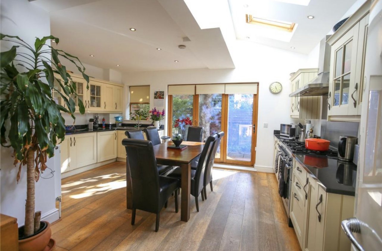
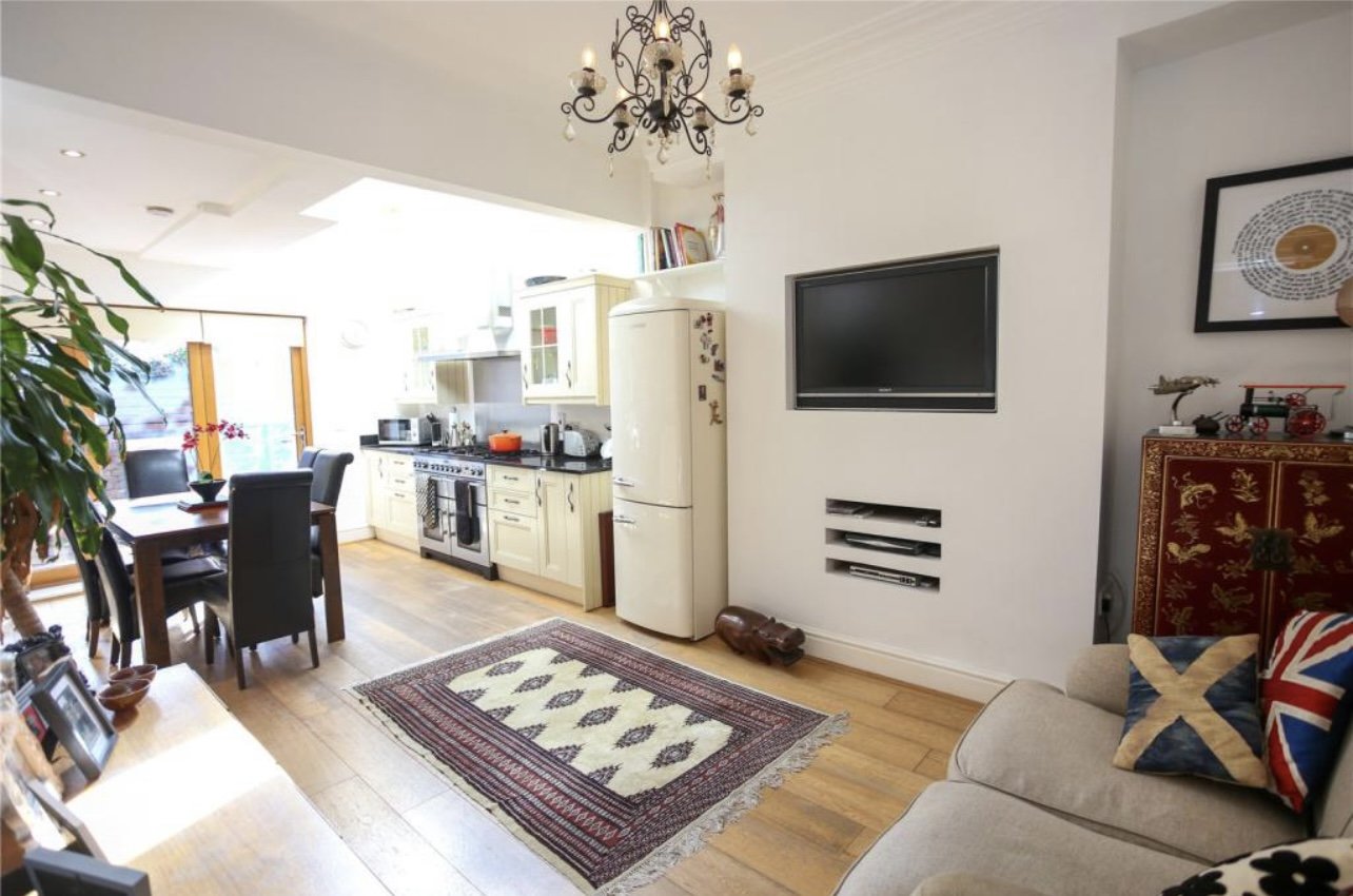
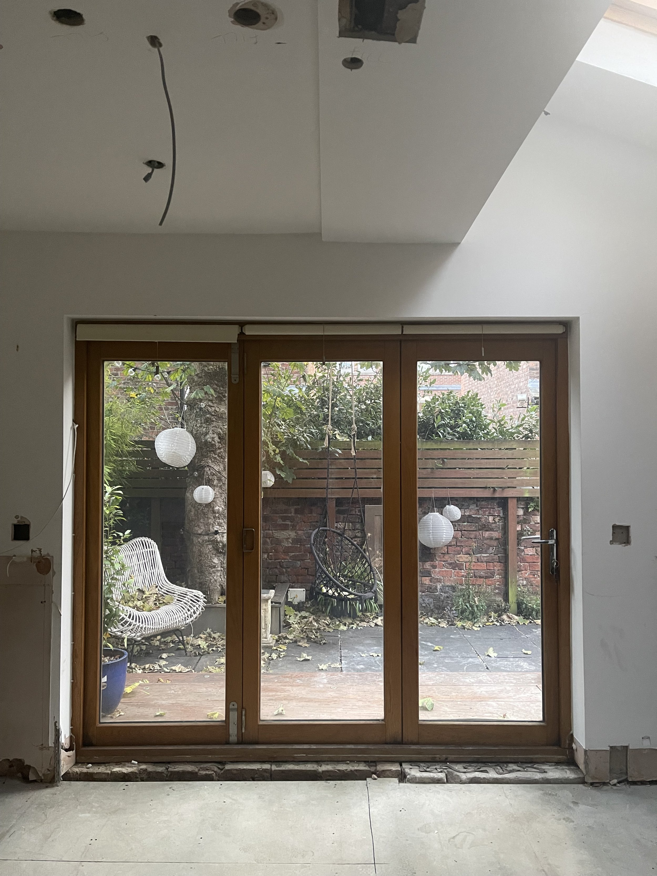
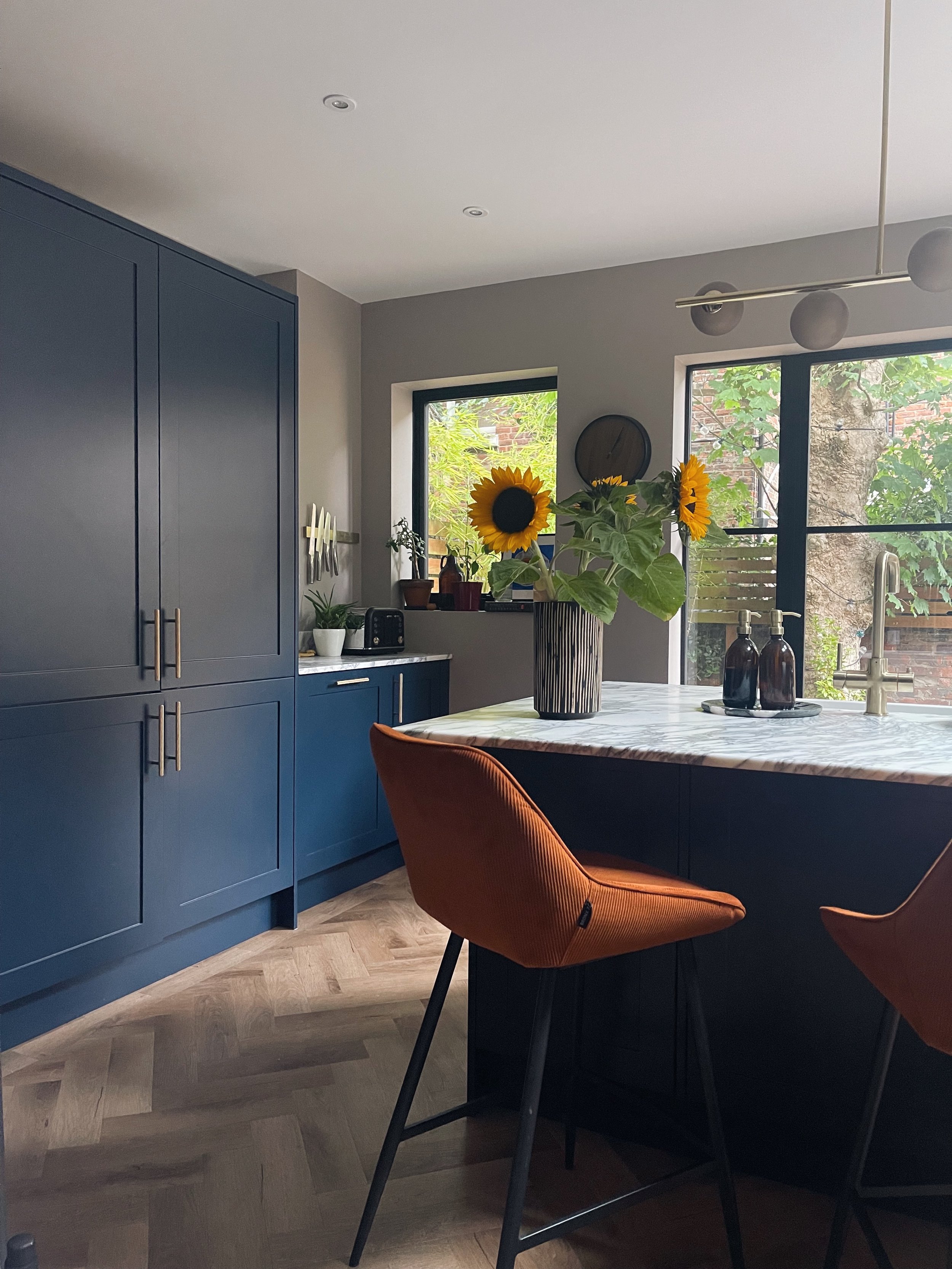
We moved into this house in March 2021 and decided to focus on some other smaller/easier rooms first. The quick fixes if you like. As you can see from the estate agent photos, the previous owners used this room as a kitchen/diner/living room all in one so the layout was suited to that purpose. If you followed me for a while, you’ll know that dining rooms/dinner parties and keeping living separate is my jam so we ended up with a huge “dancefloor” in the middle of the kitchen. This layout just wasn’t working for us.

I design kitchens for a living - albeit CGI kitchens - but I’ve learnt a lot along the way and three things I really, really wanted one were :

  1. A kitchen island

  2. Statement worktops

  3. Crittall Doors

Another perk of the job is meeting the right people and when Luke from Nord Kitchens set up his business, I knew exactly who I needed to plan and measure the kitchen correctly. My strengths lie in making it look good, not how many mms you need to make it fit.

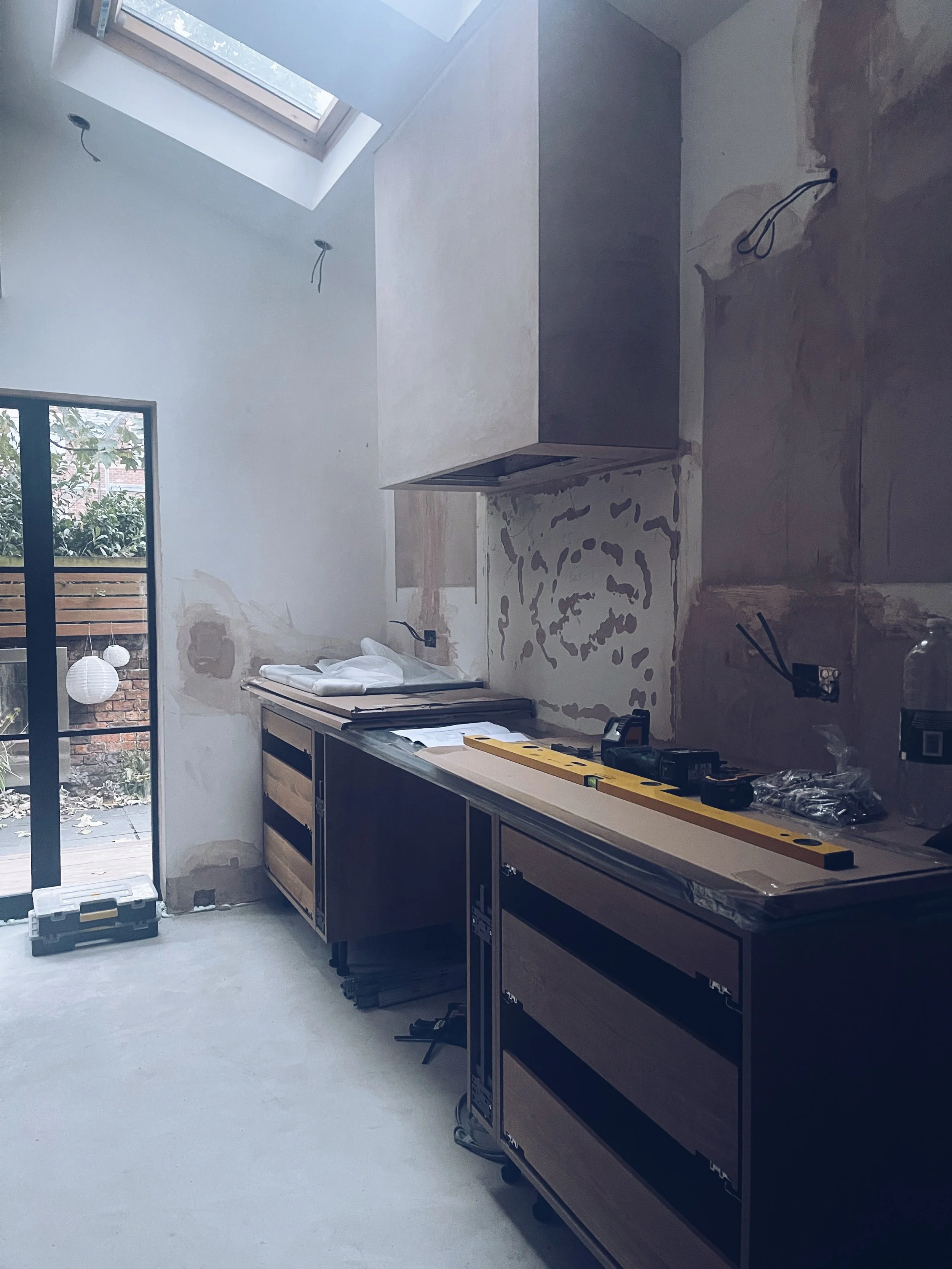
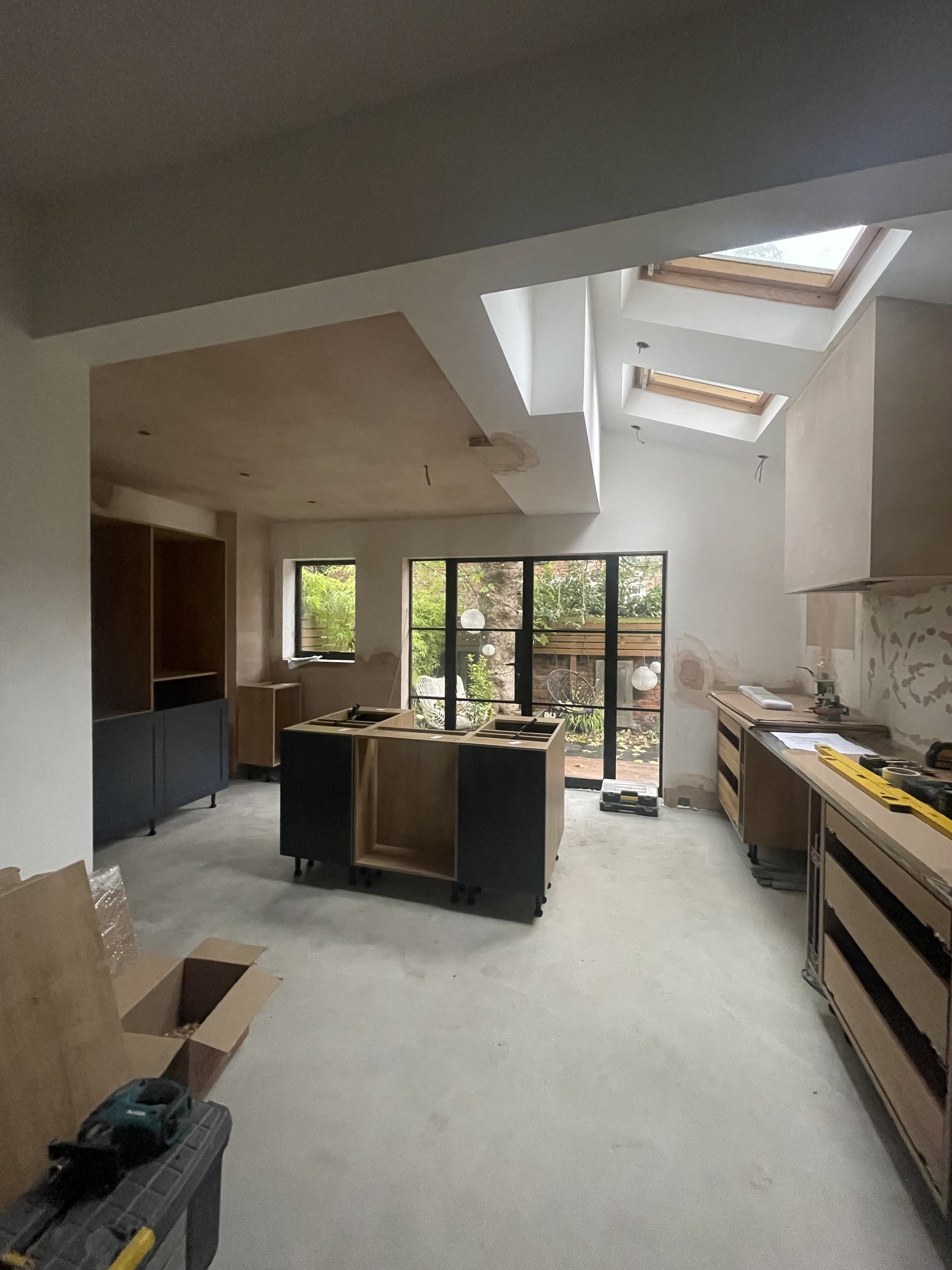
The space was structurally sound, bar a leak from the bathroom, as it was a “newish” extension. So we kept the bones as they were which worked in our favour for timelines.

Floor Plan

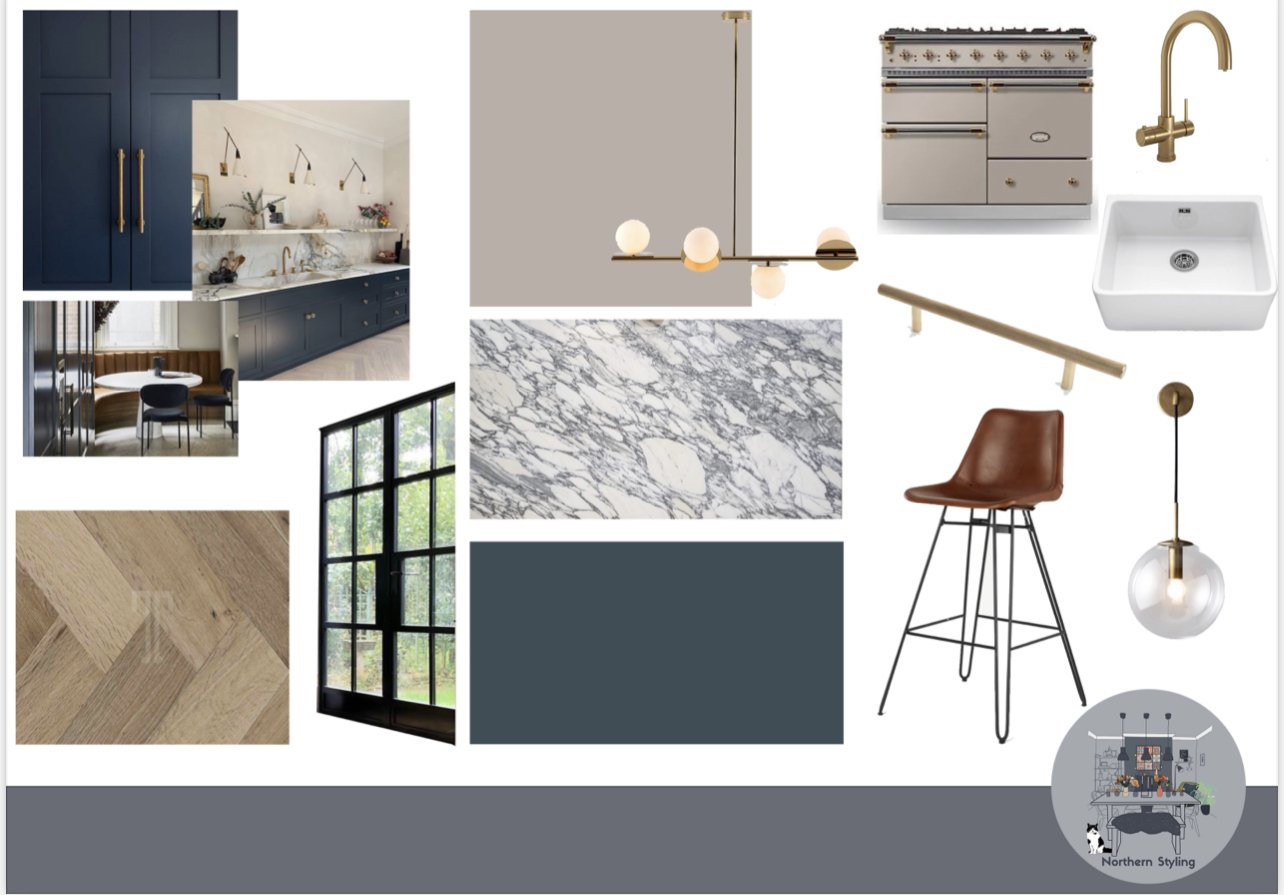
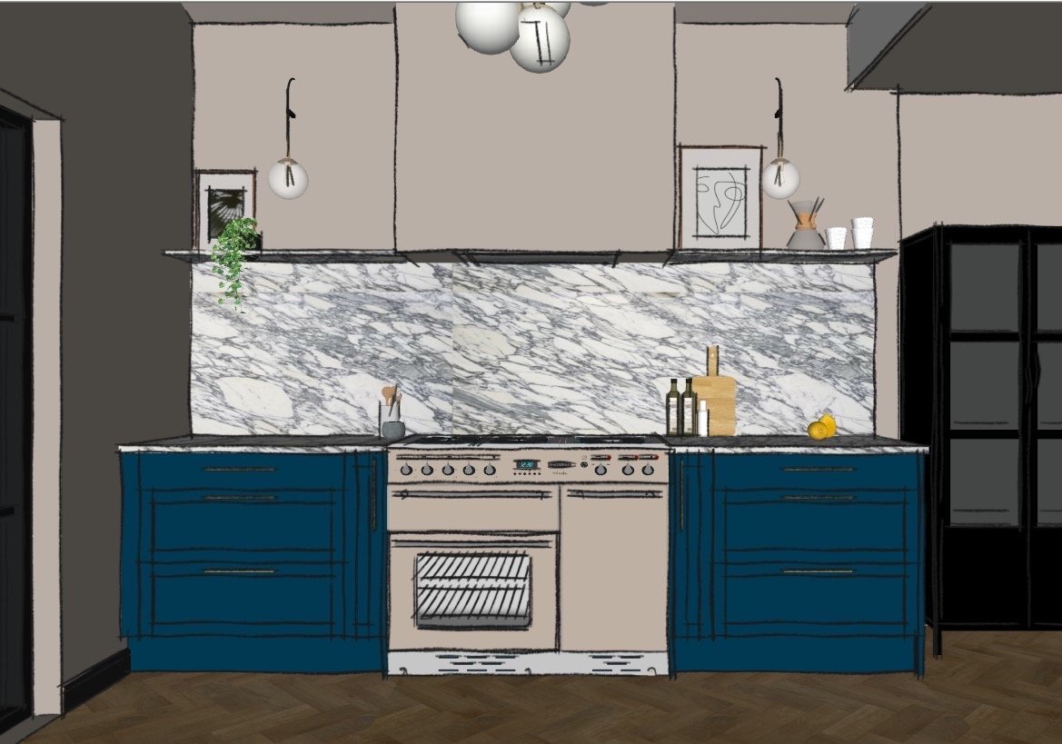
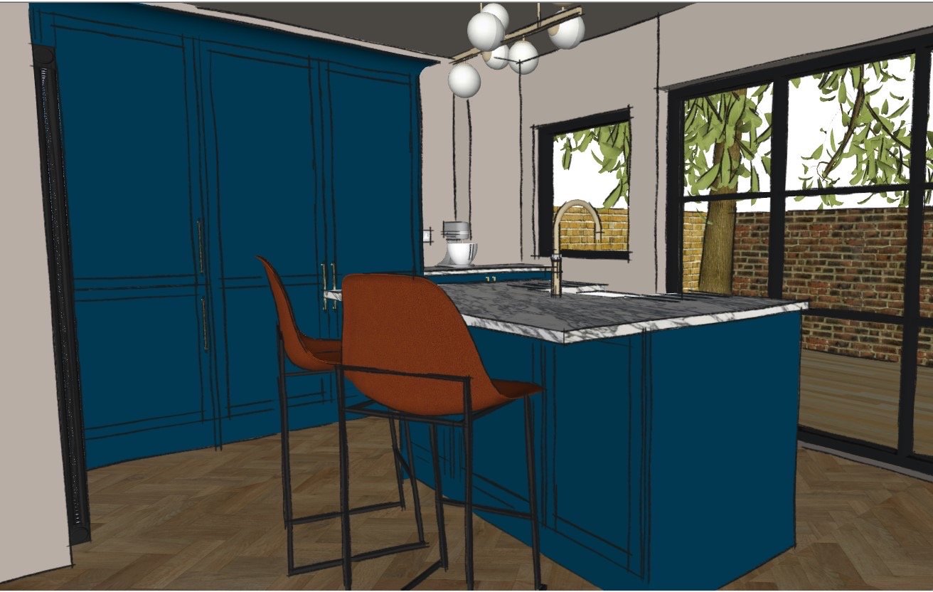
I gave Luke my moodboard (mainly pinterest /saved instagram images) and he measured up, working up a sketch render for us to look at. You would probably get a very basic version of this if you went to a mainstream kitchen showroom.

We discussed and measured, and remeasured, and then tweaked a few bits but all in all he nailed what I wanted. (Caveat - I did go into the sketchup and added some styling bits as that’s what I do day in, day out - I couldn’t resist.)

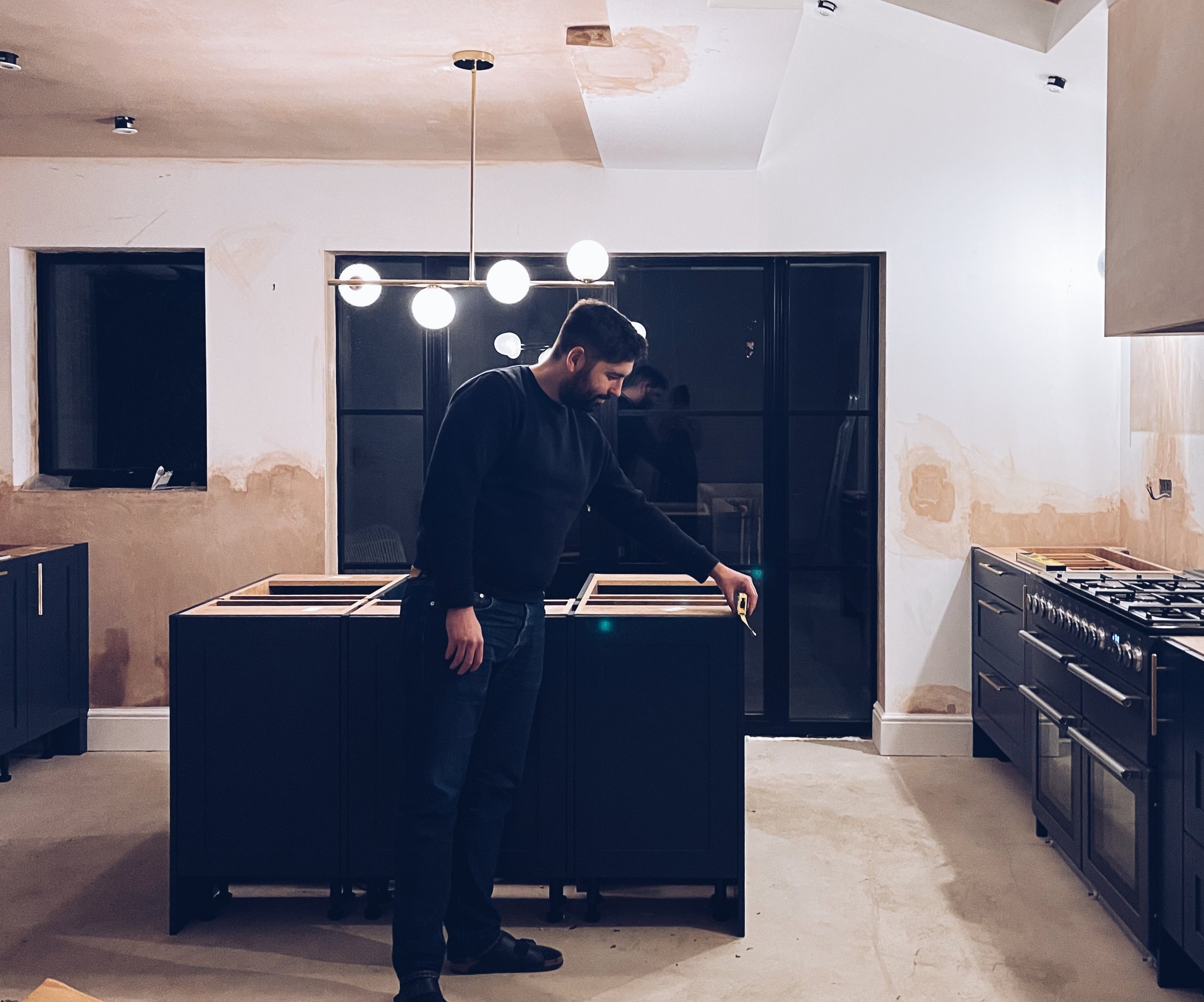
Then everything was set in motion and we made sure all the pieces of the puzzle aligned. One thing I would say is having Luke “project manage” the whole fit out was a God send for us. Making sure builders turned up on time, organising a kitchen fitter for the correct dates and giving us a clear timeline for the bits we needed to sort out like a floor fitter and decorator was invaluable.

The Middle

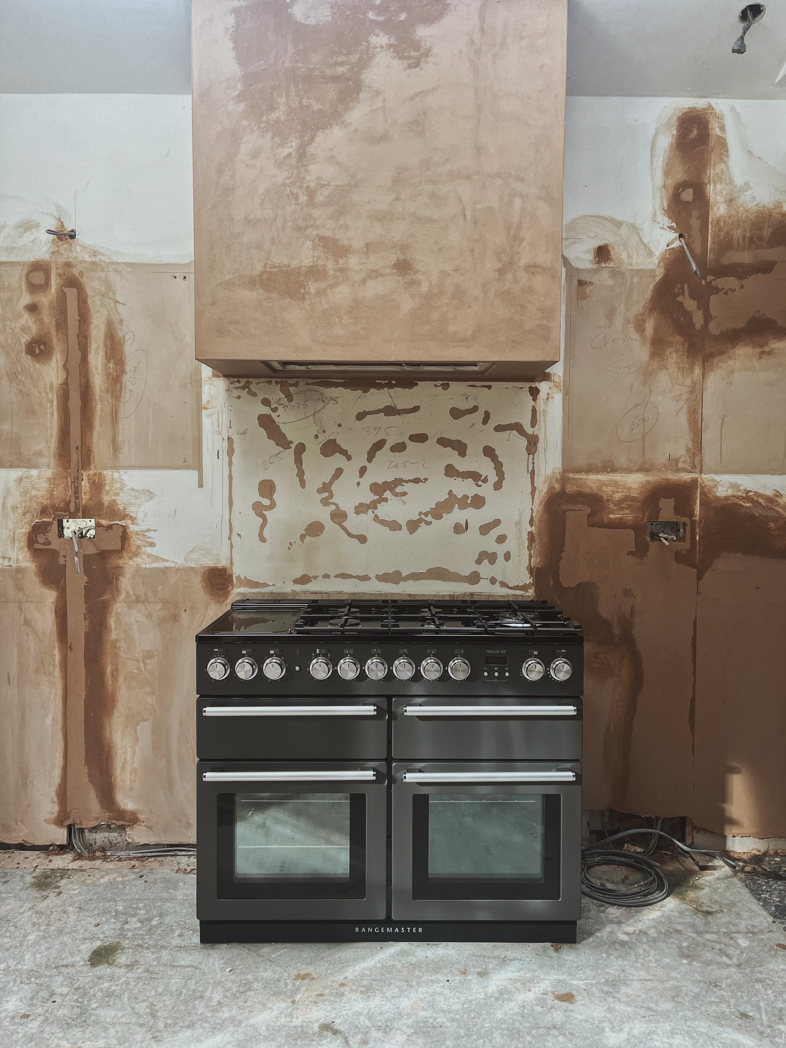
Everything was ripped out, the old kitchen, the floor, the skirting boards, the doors at the end of October 2021. We said goodbye to home cooked meals and hello to dust and takeaways. I was 7 months pregnant at the time and it was not ideal! But it was way better than the baby actually being here which I’ve now realised. Plus being pregnant meant no one wanted to p**s me off!

Marble on!

The Doors

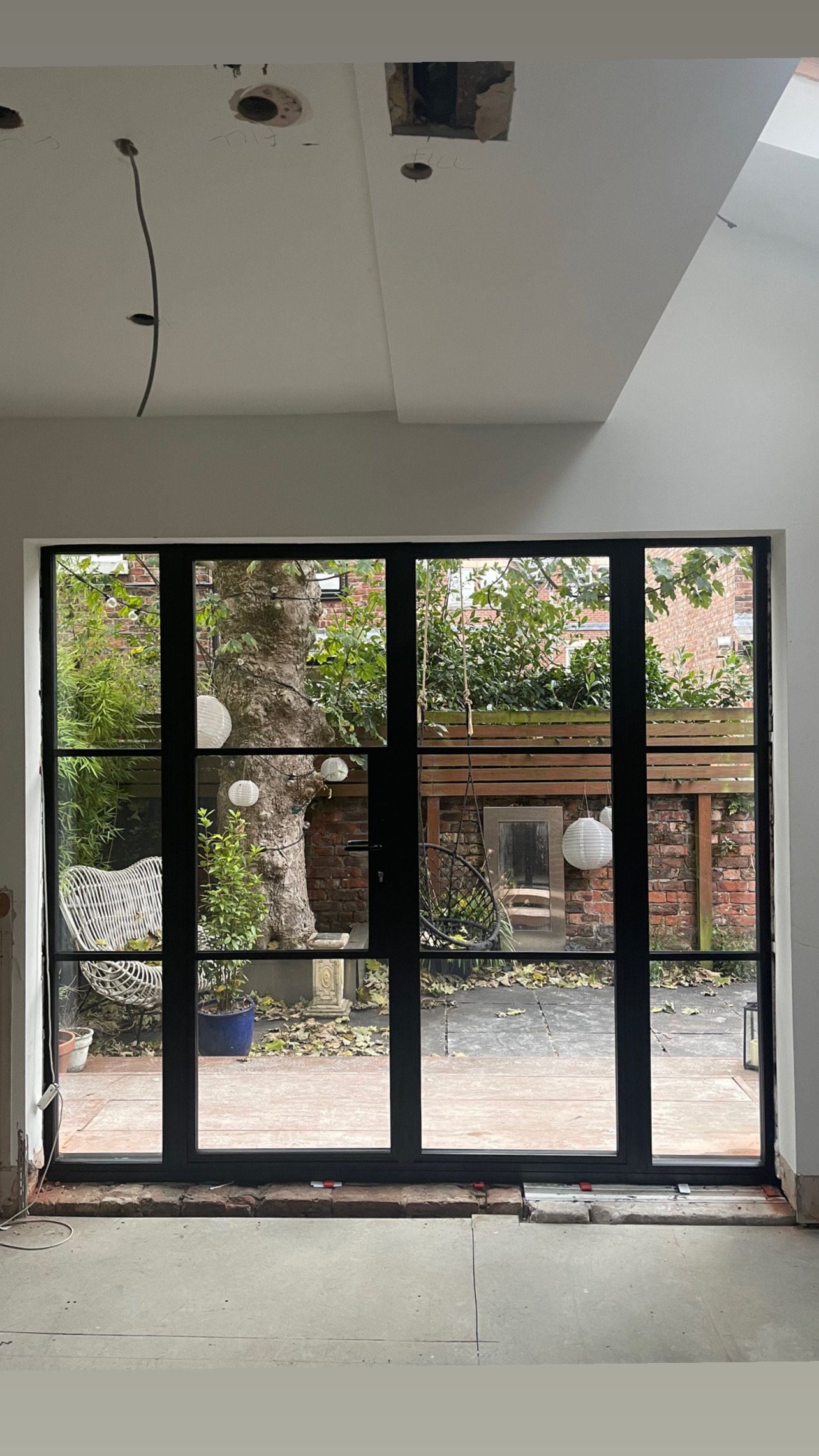
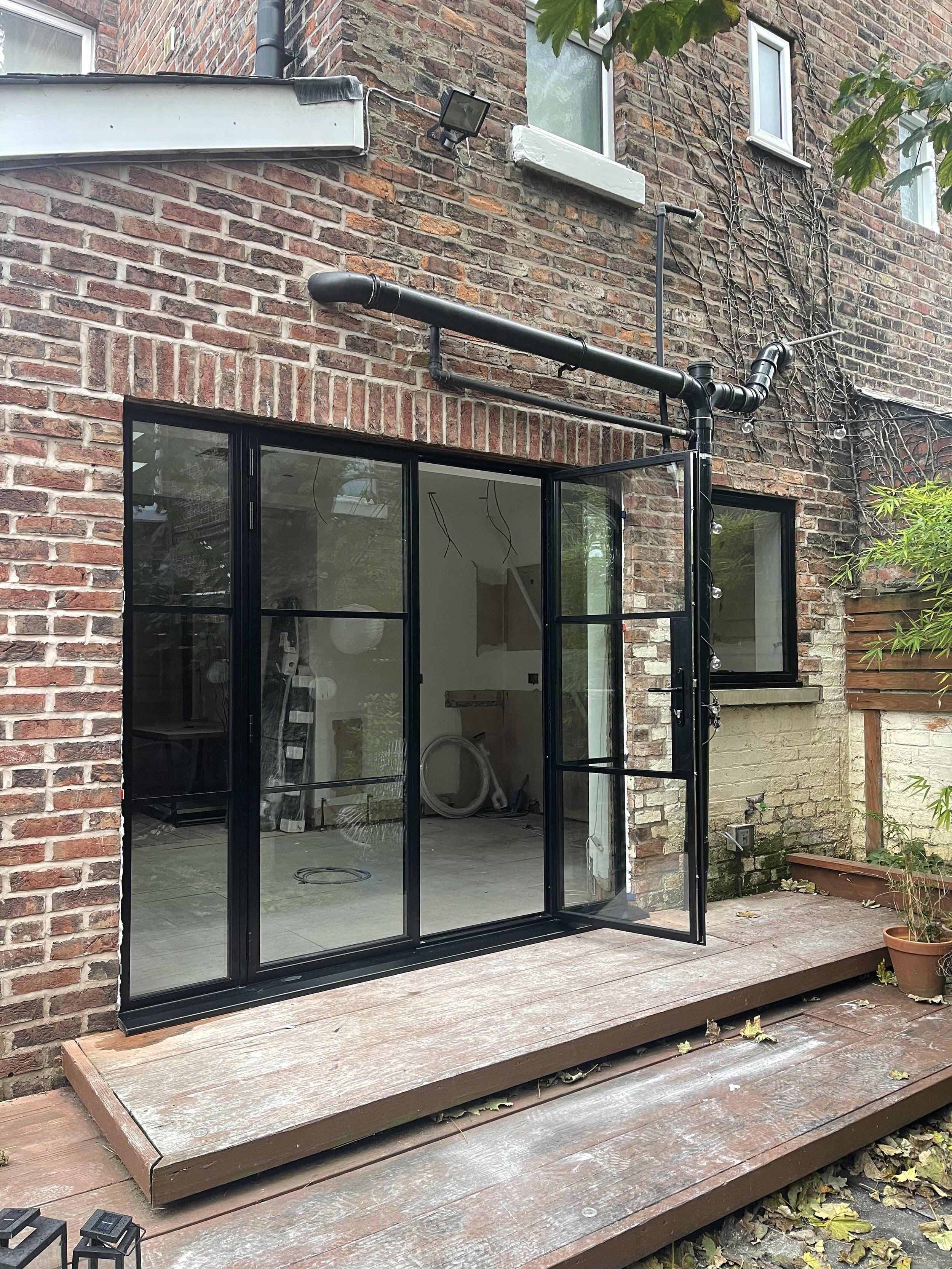
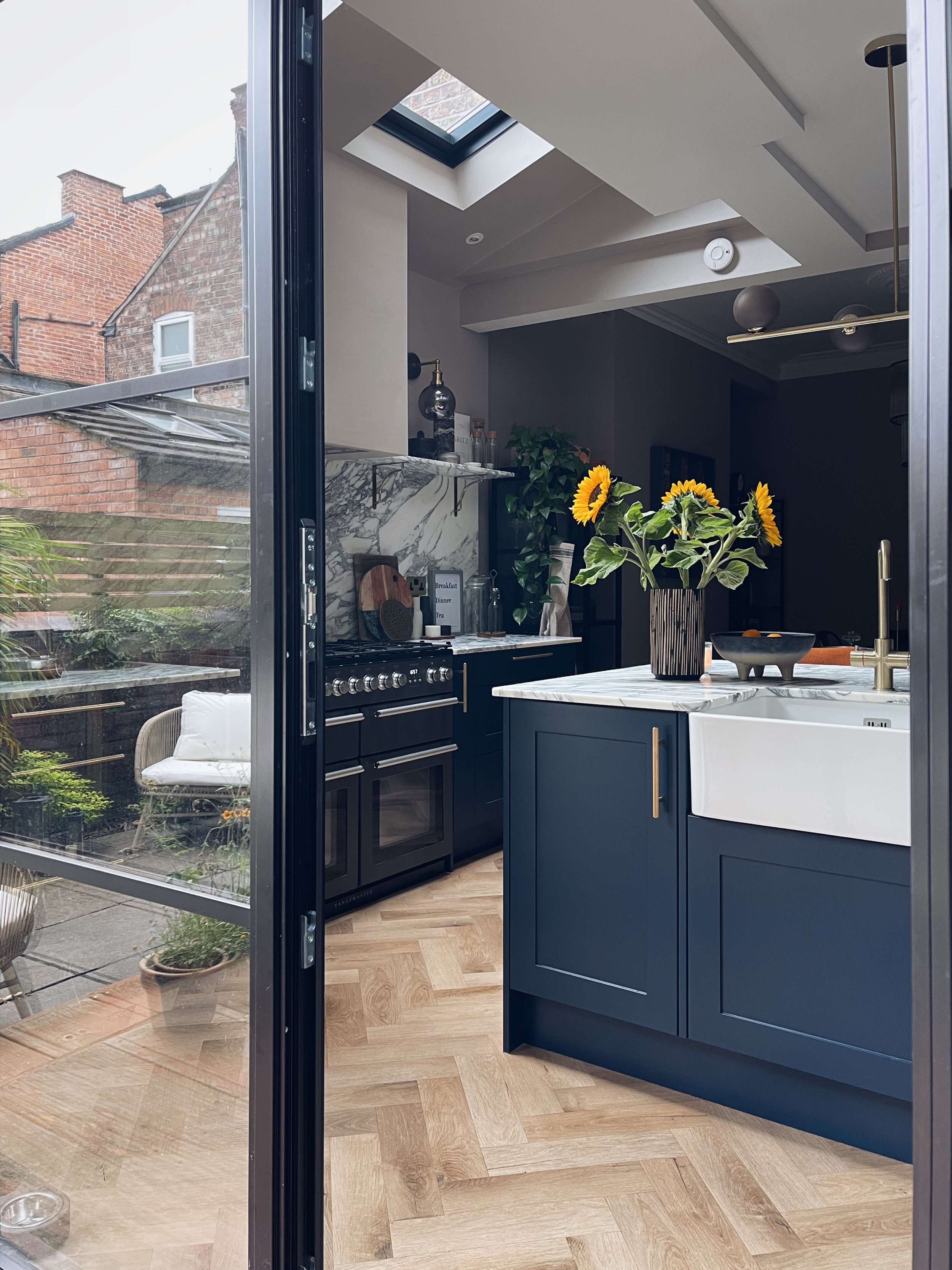
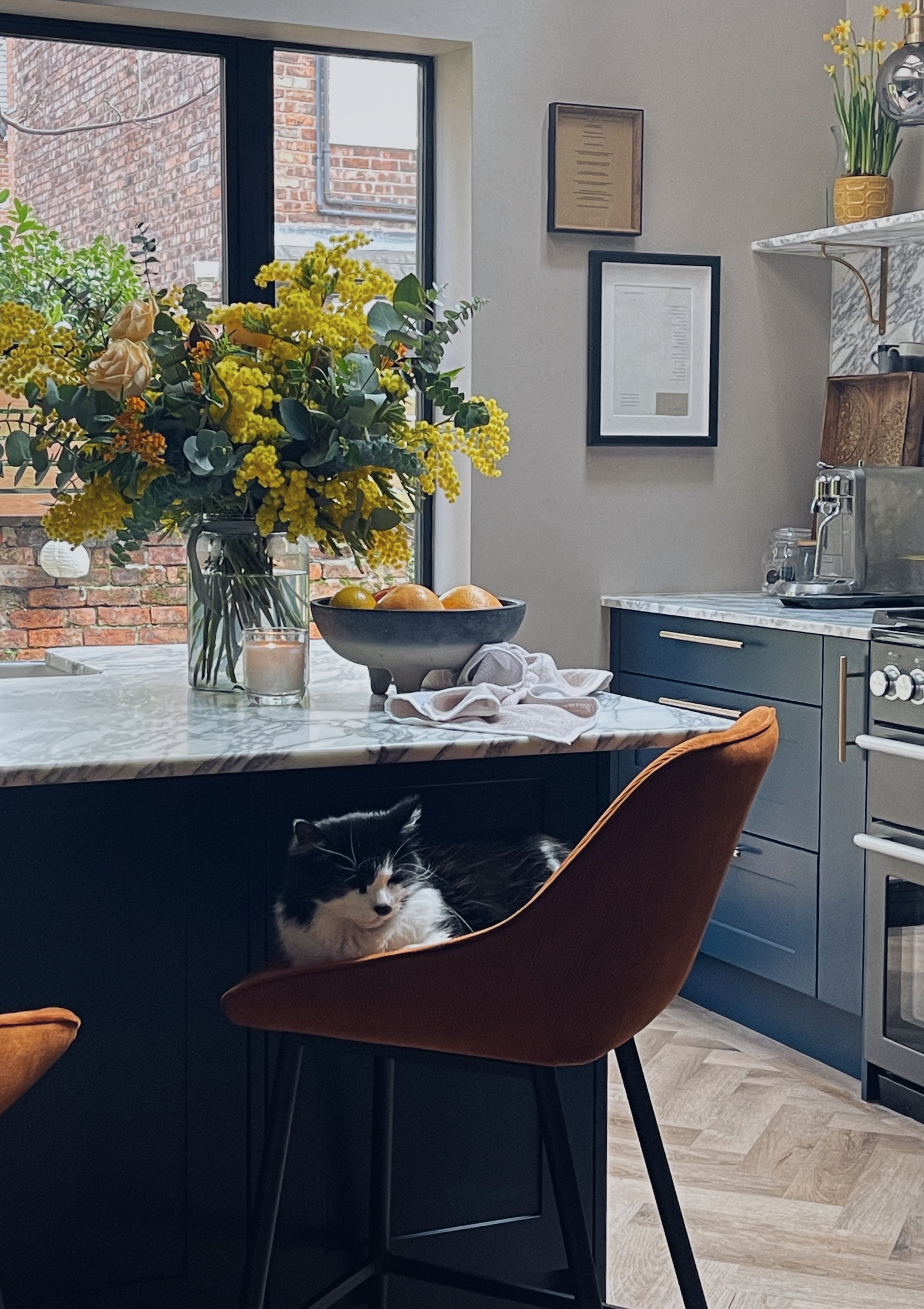
We said goodbye to the old rotted bi-folds and hello to the “Crittall” doors. If you’ve ever gotten a quote for real crittall then you’ll know they don’t come cheap so we went with the next best thing - aluminium. They are Aluco Aluminium doors, supplied and fitted by John Knight Glass. The whole process was super simple, quick and everyone was so friendly. I would highly recommend. I sent across measurements and John Knight Glass mocked up a couple of designs. They then came out and measured properly, installing everything in a day.

The Details


Now this is where I get really excited - choosing all the pretty bits to build into a nice cohesive design.

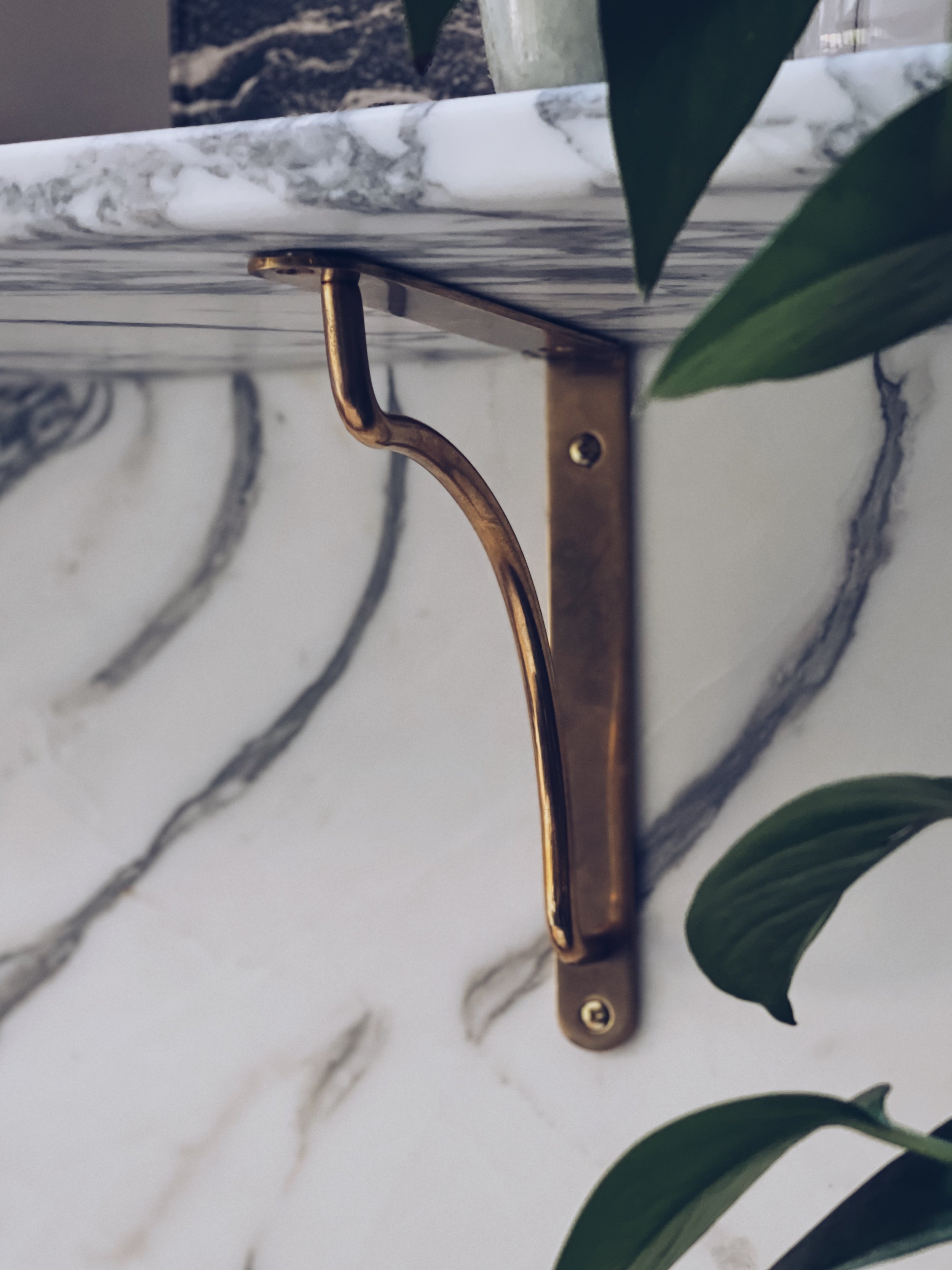
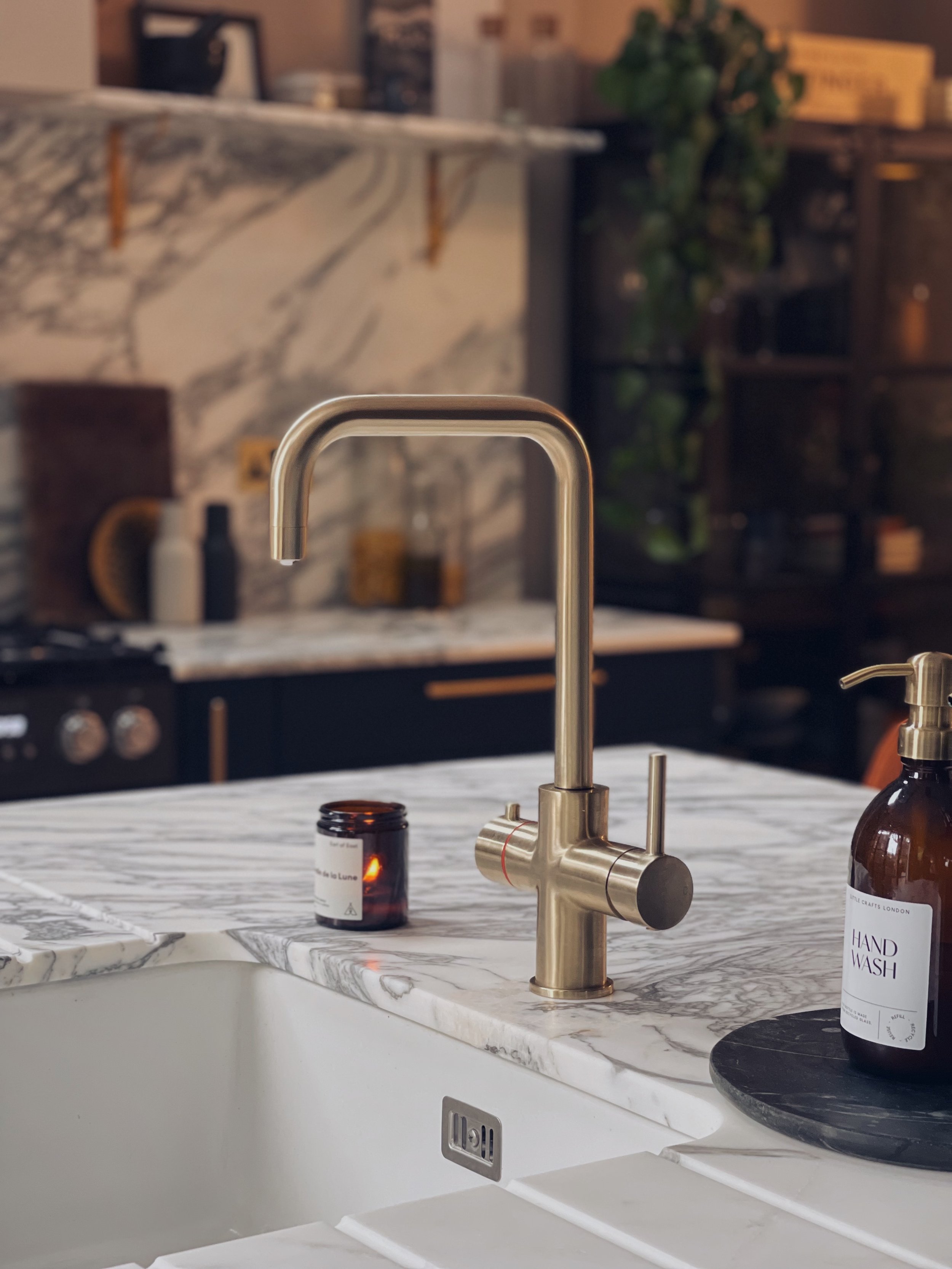
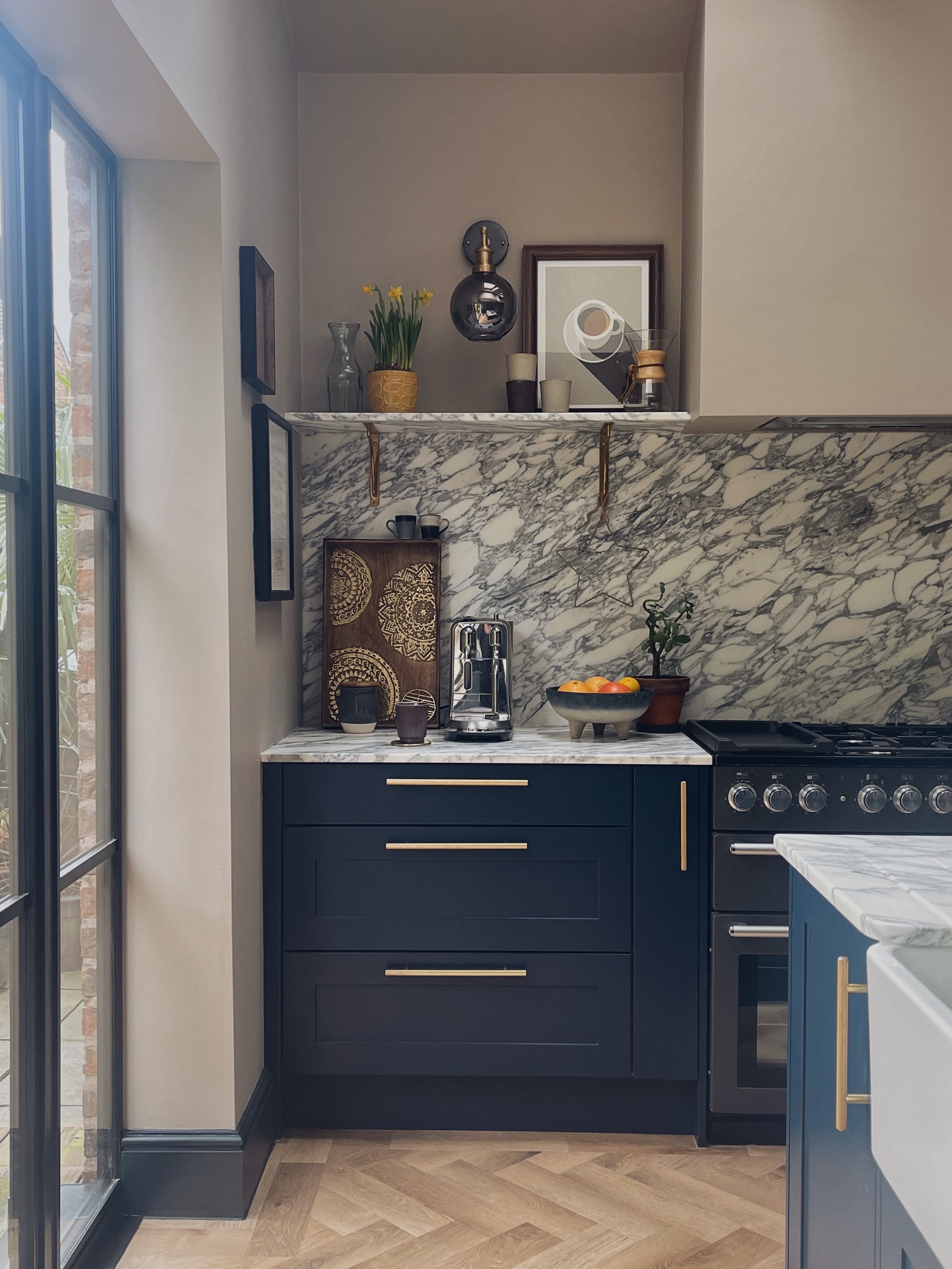
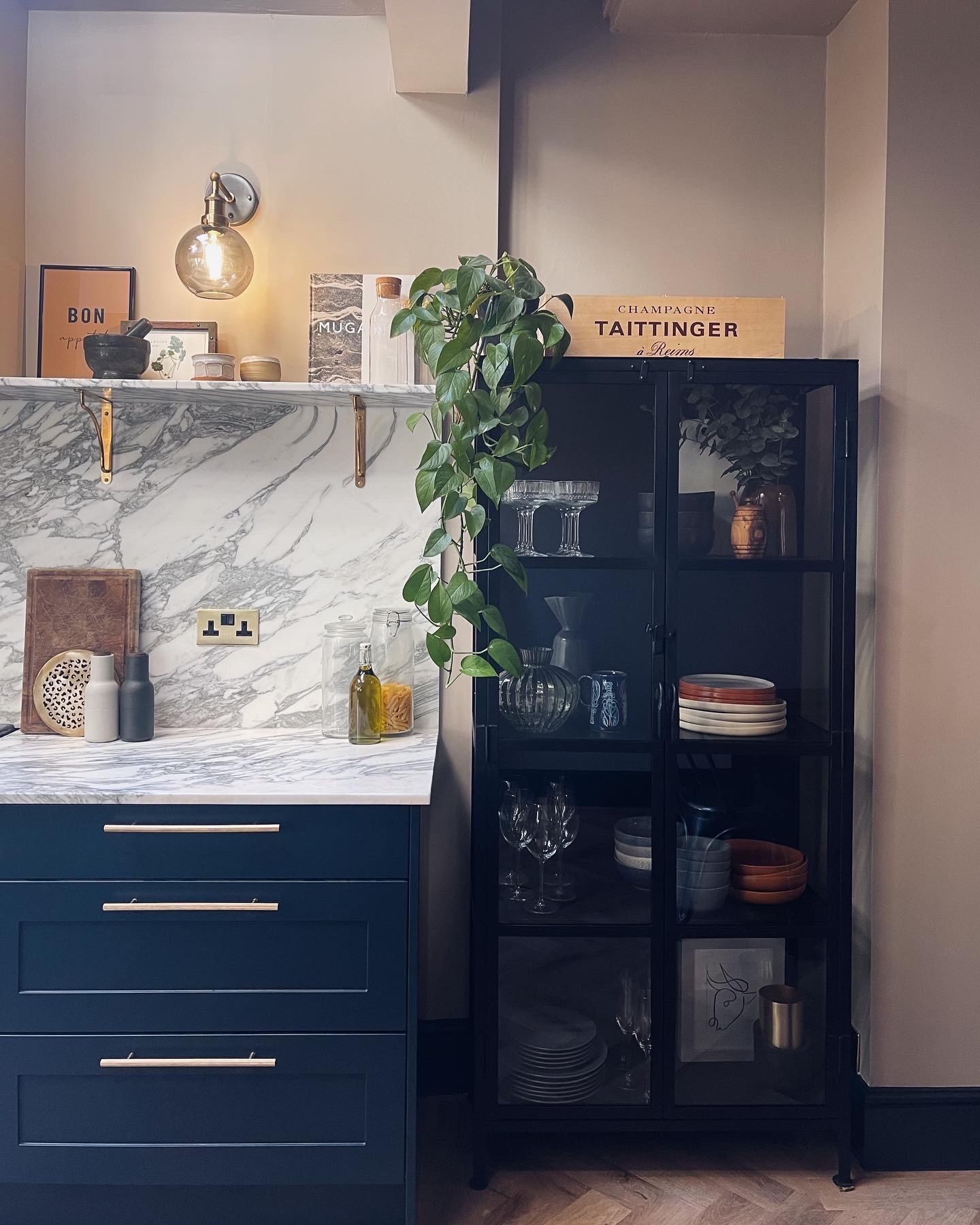
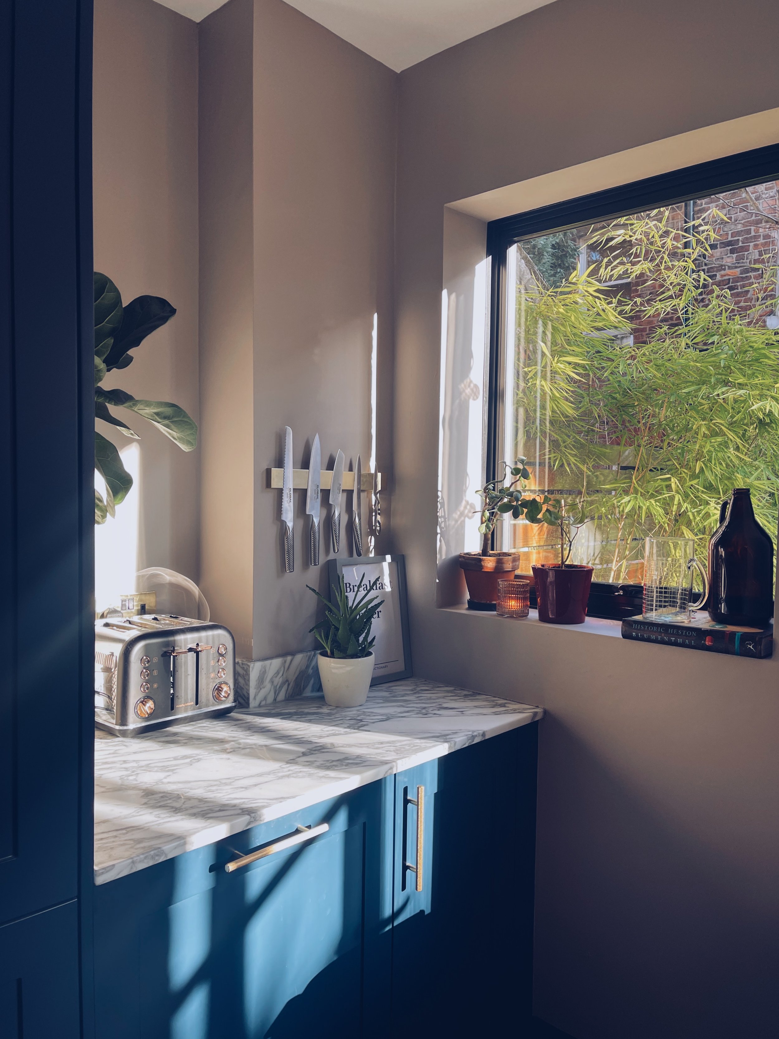
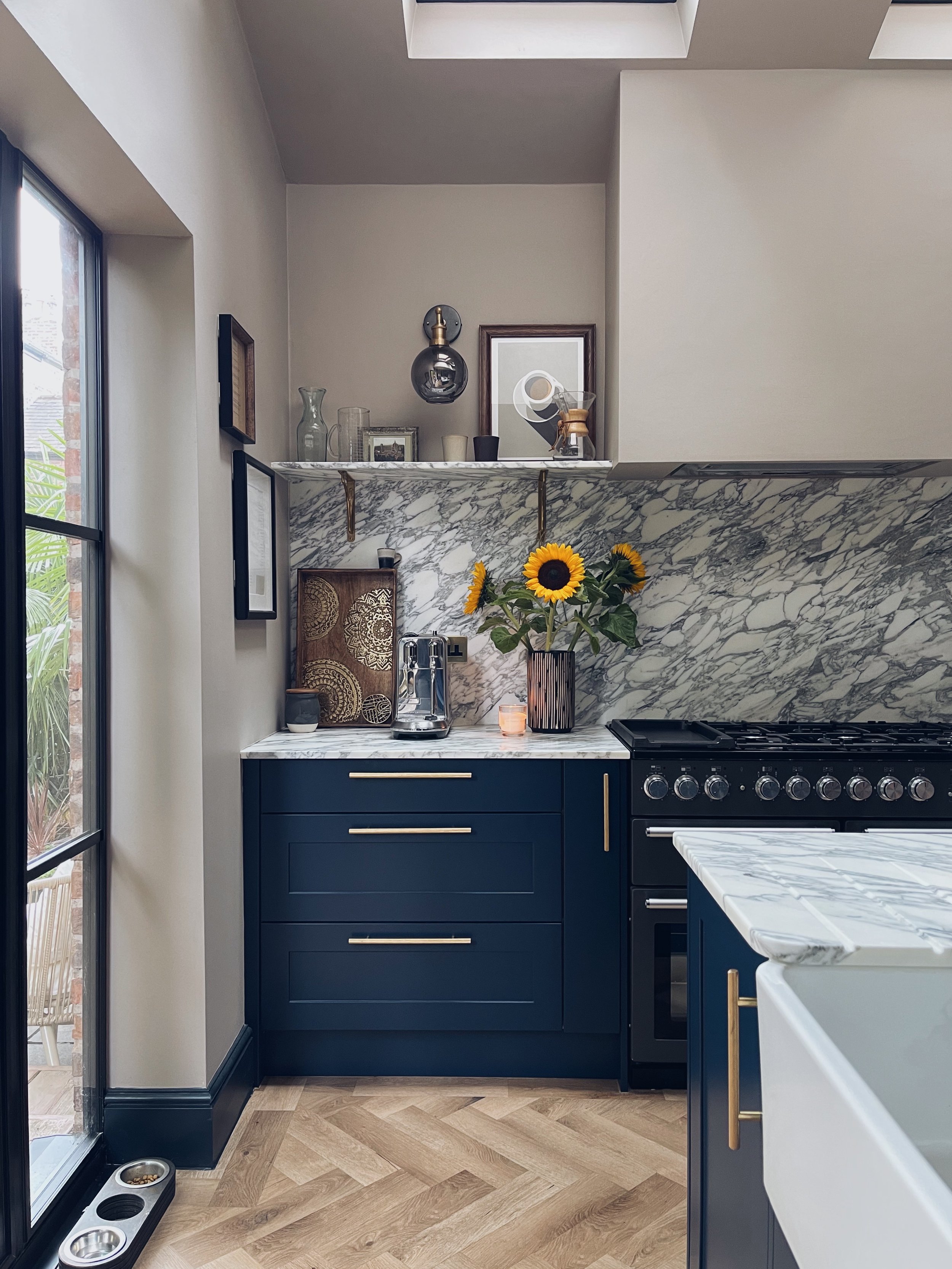
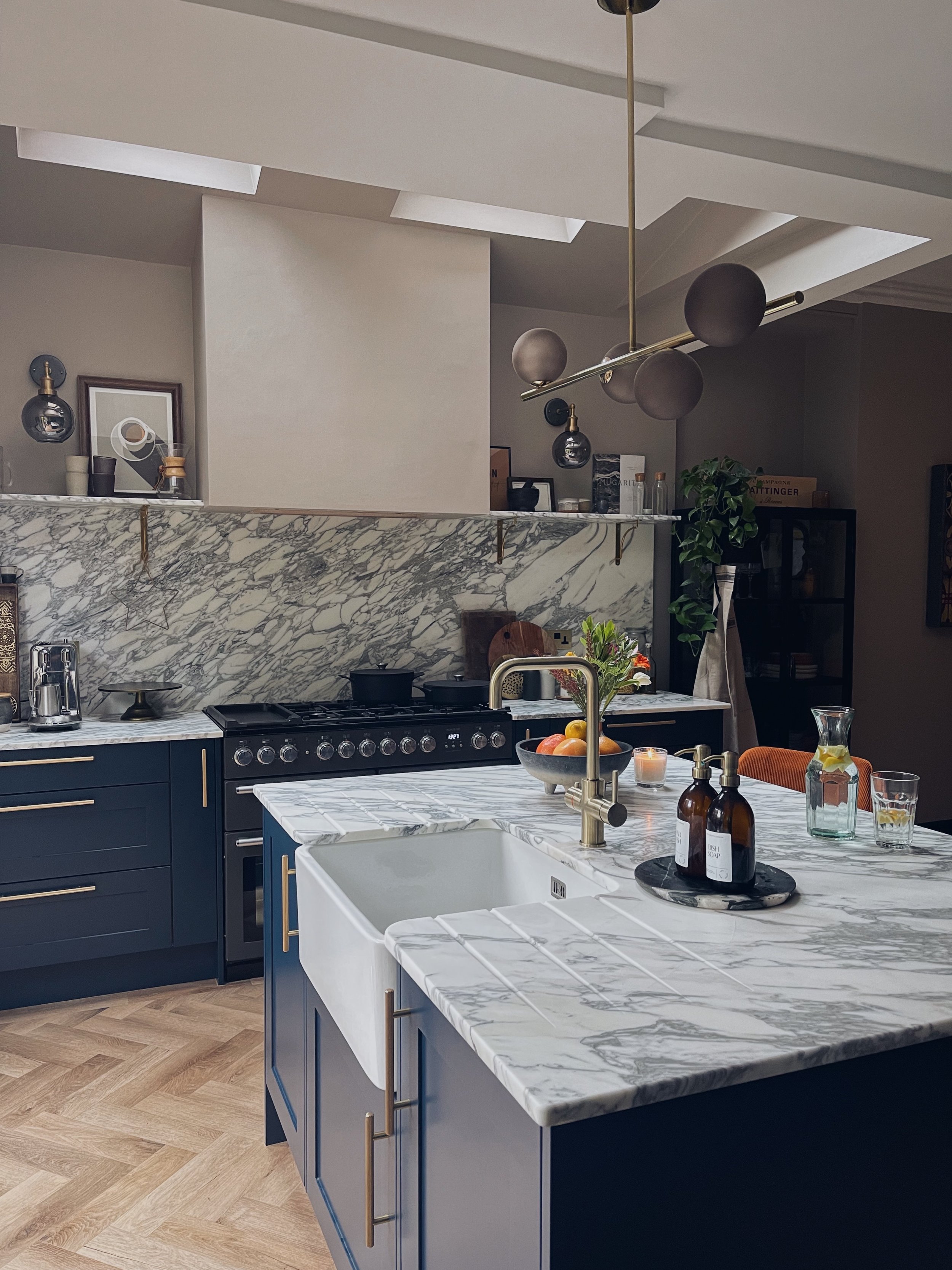
The main expensive of this kitchen was the marble. There’s no skirting around the issue - if you want the real deal then it’s a pricey affair. We ‘ummed’ and ‘ahhed’ for a few weeks, looking at all the other options available but in my opinion there just isn’t a marble effect laminate that can compete with the natural beauty of the real thing. I knew I wanted a statement vein so Arabescato Marble was the perfect choice for us. Maybe in a few years there will be some advances in designs but the wow factor of this vein is still going strong even 11 months on.

There are pros and cons of marble which I will save for another blog post as this is going on long enough! Well done for getting this far! Not long left, I promise.

I tied in the brass accents through the shelving brackets, handles and switches. We took a punt on a relatively unknown hot water tap brand Fohen - because it was the only tap on the market which has the right brass tone that I wanted. Plus it was a hell of a lot cheaper than the other leading market taps so it was a clear winner. (PR discount)

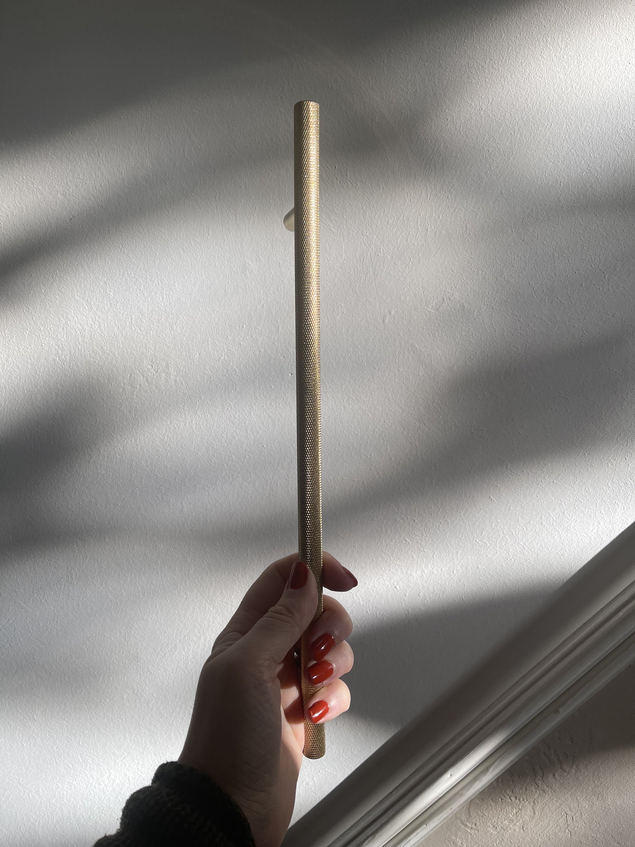
Handles were from my favourite supplier Dowsing & Reynolds, having collaborated with them in my previous kitchen revamp. I went for the Skyscraper Knurled handle in two sizes to give a nice linear look. (AD)

Handles by Dowsing & Reynolds

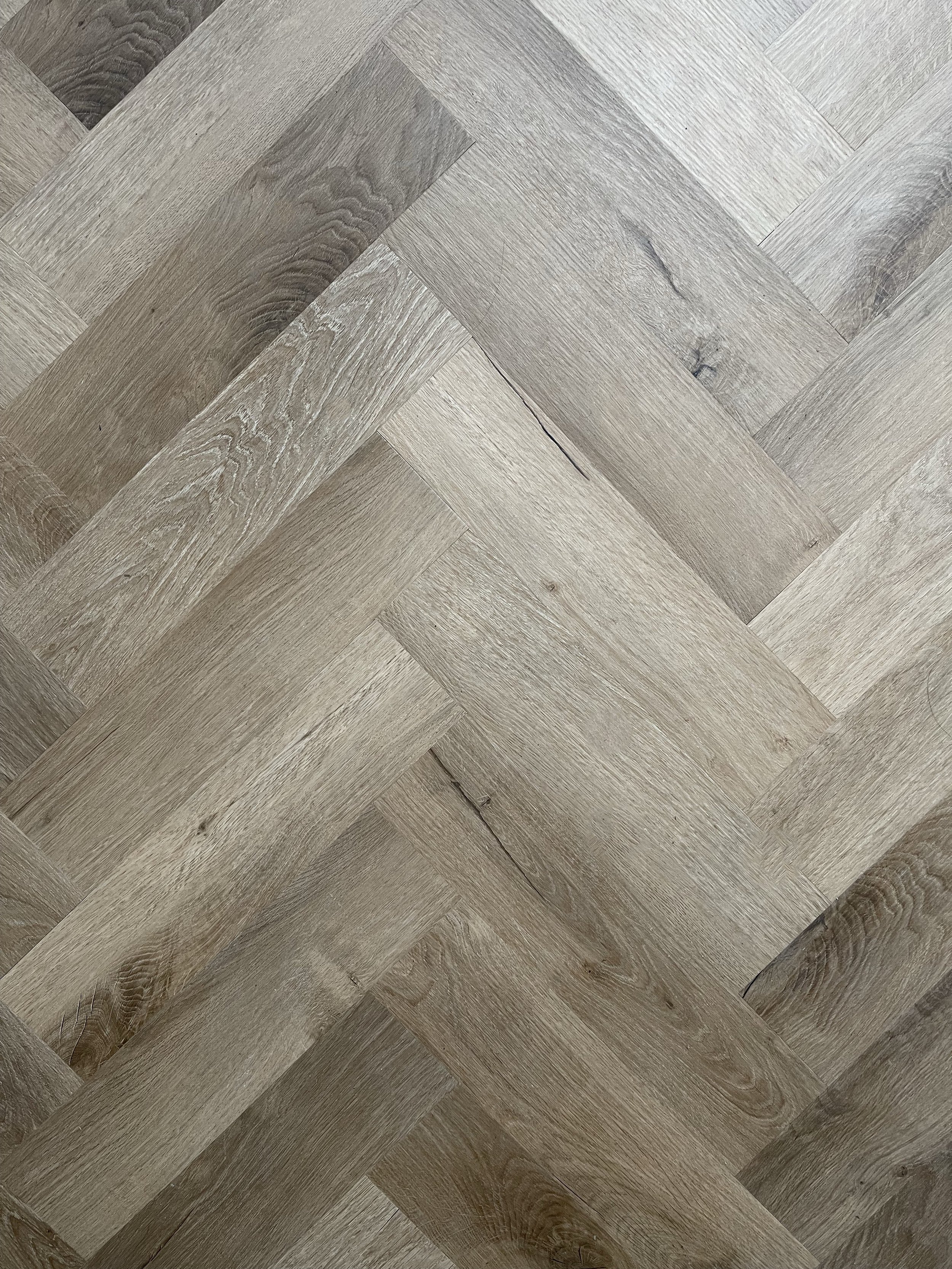
Flooring was by far the hardest choice for me. I looked at soooo many samples. Some were too yellow, some were too light. In an ideal world where money was no object, we probably would have gone with engineered wood/real timber but having blown most of the budget on the marble - LVT was the way forward. I have no regrets though, the floor looks really good for LVT and the marble wins every time.

Our flooring fitter introduced me to Invictus and i picked the floor without seeing it in real life. Their visualiser is that good in my opinion. We went for Royal Oak Traditional in herringbone and the tone of the wood fits perfectly with the rest of the scheme.

Invictus Traditional Royal Oak

The End

The whole thing took about 7 weeks from start to finish, just in time for Christmas. It wasn’t fun living through it but 100% worth it in the end. I won’t bore you with an in depth breakdown of timings but if you would like to know then just give me a shout.

Rest of the Details

Walls : Valspar Smooth Pebbles

Skirting Boards : Valspar Evening Coat

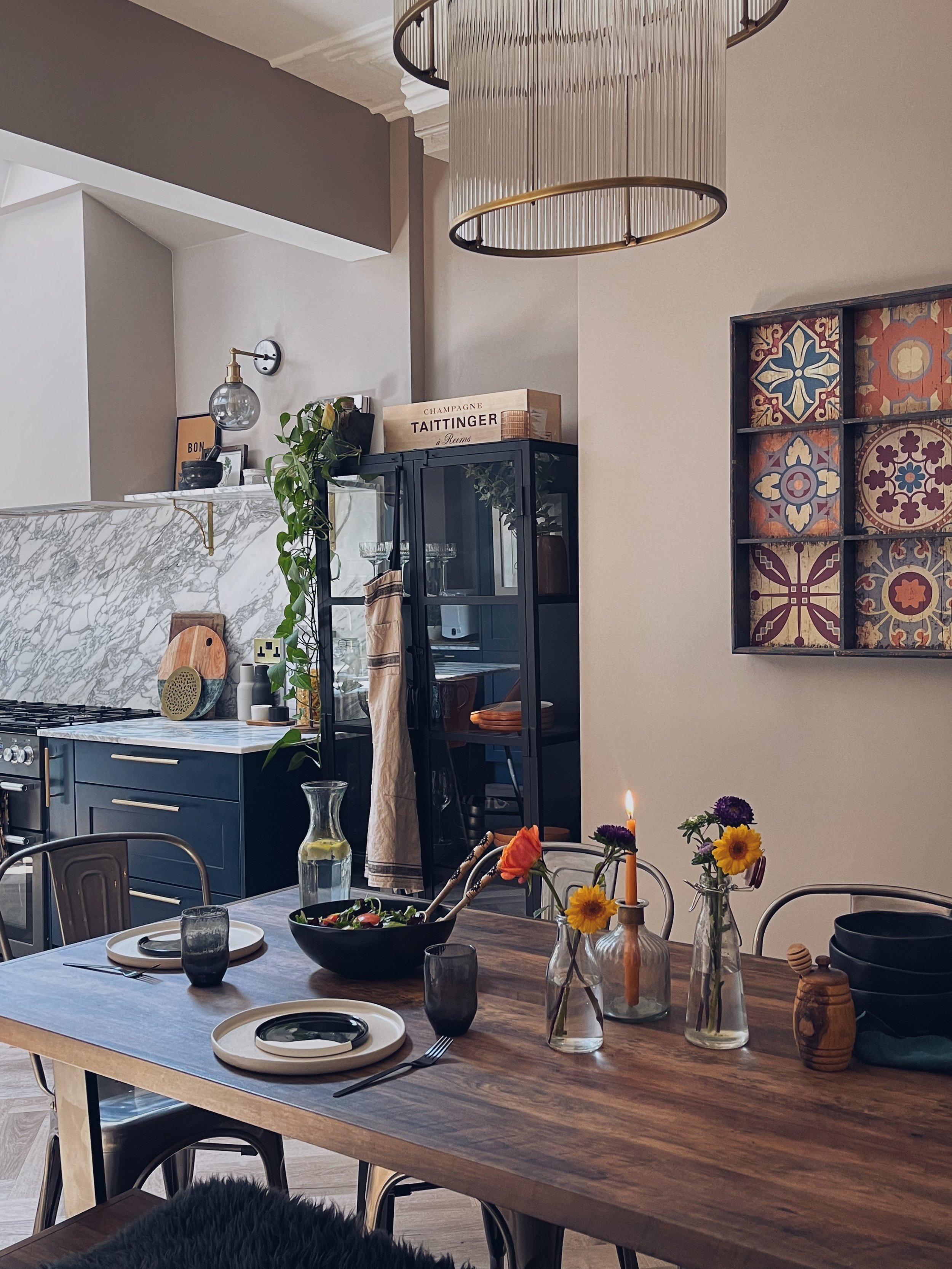
Bar Cabinet : Atkin & Thyme

Kitchen Cabinet : Nordal Interiors

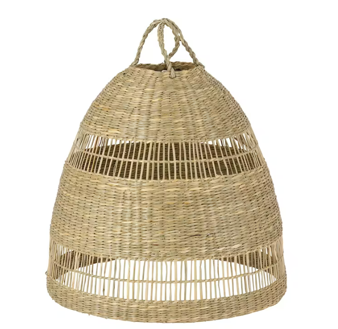
Pendant Light : Lights and Lamps

Wall Lights : Industville

Chandelier : Pooky Lights

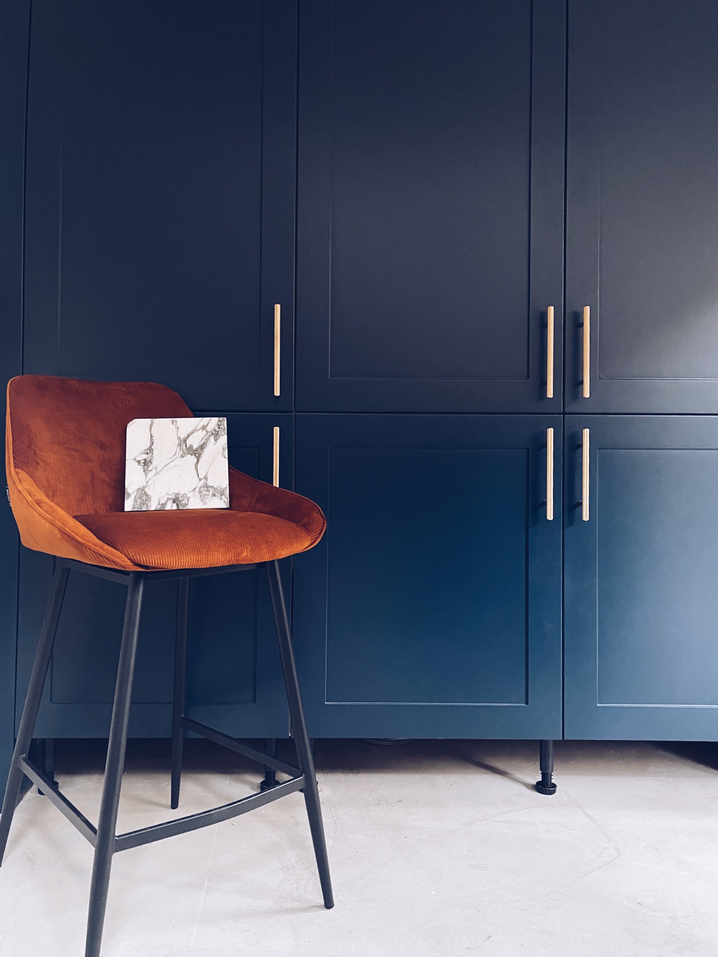
Bar Stools : Furnwise

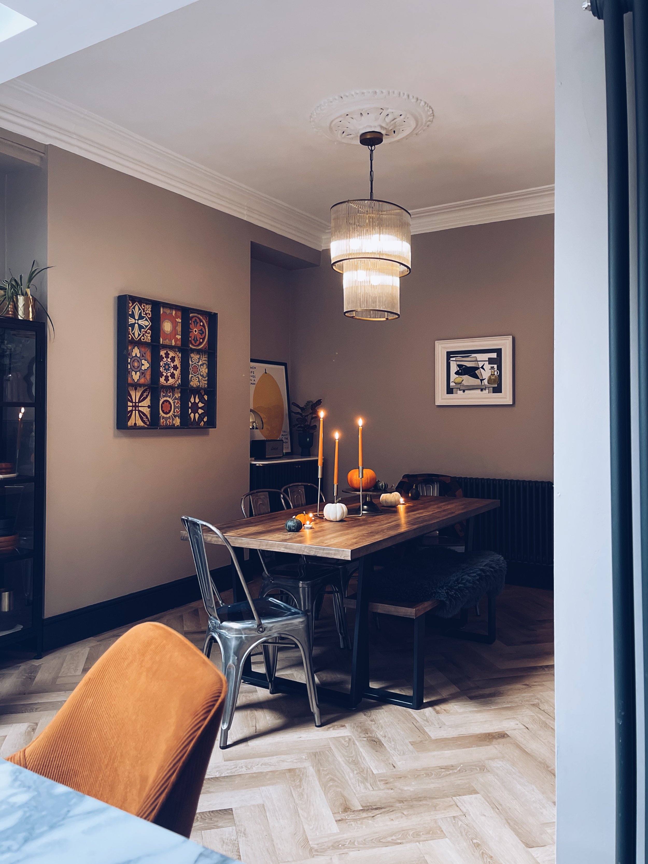
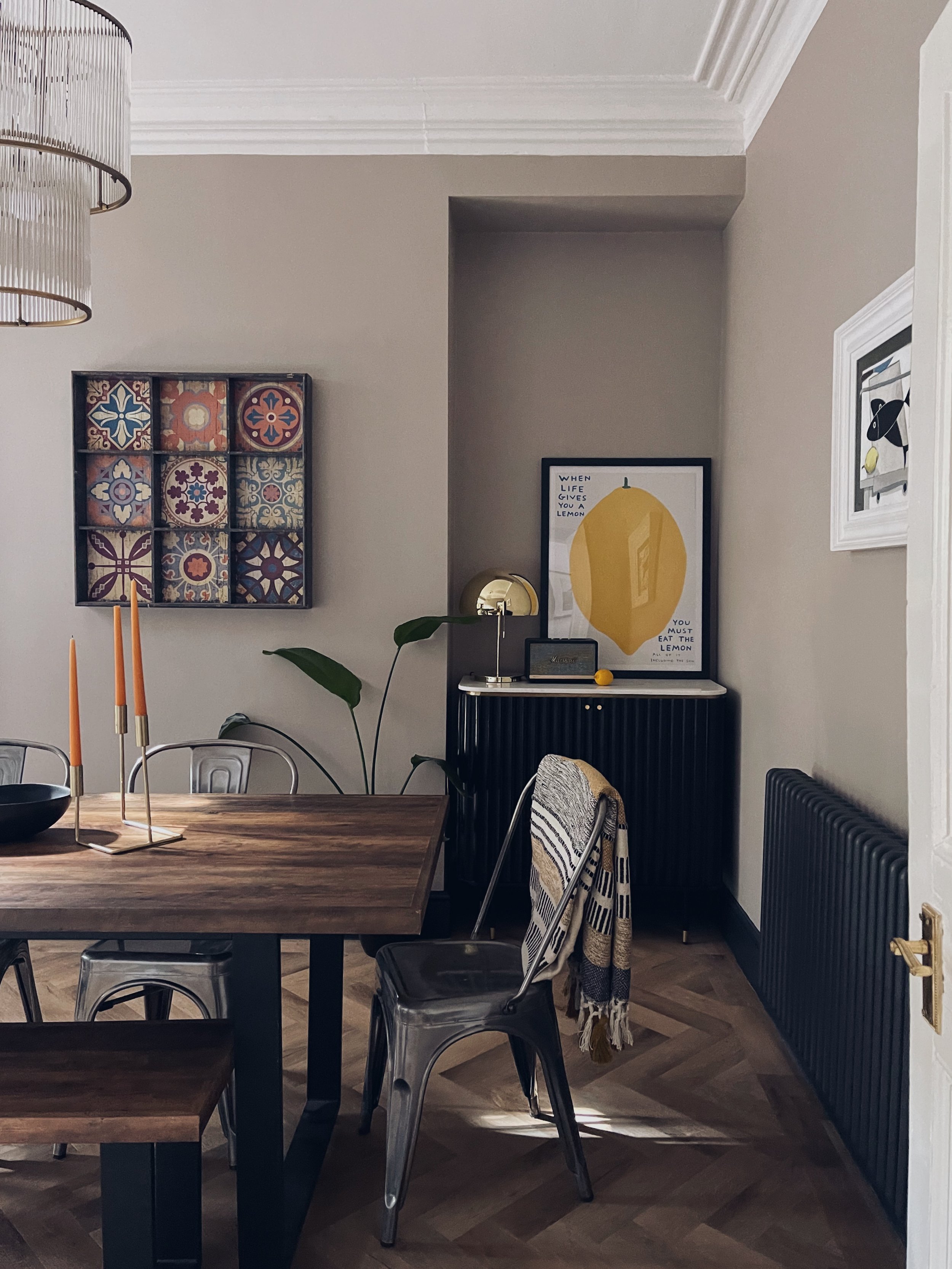
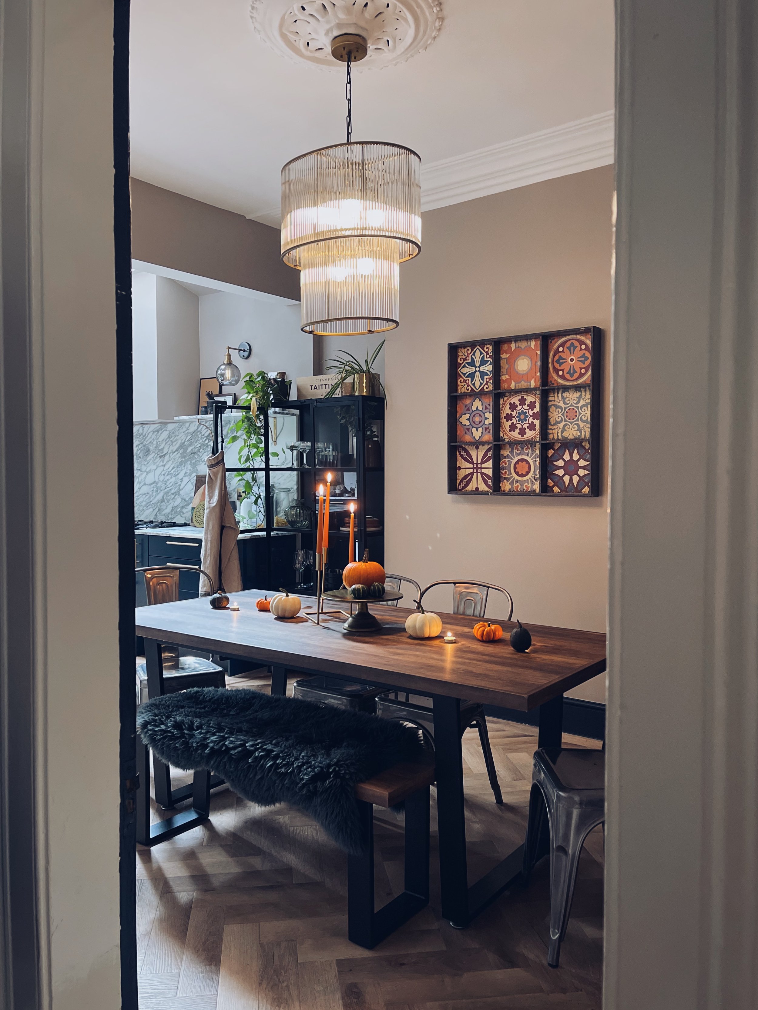
The dining room was finished off around 8 months after the kitchen because I had the small matter of giving birth to a tiny human and navigating motherhood in between. It saw the return of the infamous ‘wall hangy thing’ which pretty much built my Instagram and slowly I have found the time to do tablescapes again. There have only been a few new additions like the bar cabinet but we have kept the dining table and chairs from the old house, although a chair update might be something we do in the future.

The kitchen was, and still is our hub of the home. I absolutely adore this space, after almost a year it never gets old. We have had a Covid Christmas in here, spring births, dappled summer rays with the doors wide open and now the lovely warm Autumn sunshine. There were many feedings on the bar stools, having people over for cuddles and cake around the kitchen island and now there is all the fun of weaning our little man.

I can’t wait for this kitchen to age and mature with our little family. Dinner parties will be back on the horizon soon!

Top 5 Sofas Of The Moment

Whilst we crack on with the rest of the house, I can only dream of a new sofa so here’s my top 5 sofas which one day, maybe, might be one of my own eventually…

Top 5 Sofas Of The Moment
  1. The Chorlton

The colour, the shape. What is not to love about Rose & Grey’s Chorlton Sofa? Don’t tell the others but this might be tipping as my current favourite.

2. Basecamp

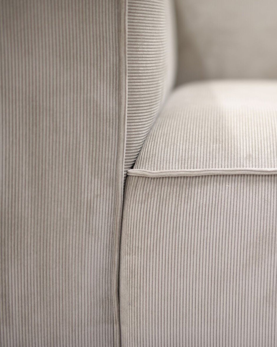
This one is SO sexy. I am obsessed with the cord. Sadly it’s a lot of money and comes all the way from Denmark but it doesn’t stop me admiring from afar.

Basecamp Sofa from Make Nordic

Basecamp Sofa from Make Nordic

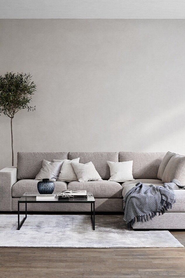
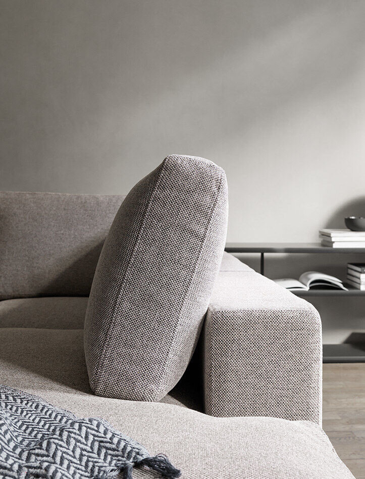
3. Cenova

Large, low and wide. The description says it all. Cenova is all about the comfort which is exactly what we need after squashing onto our current sofa for Netflix binges for the whole of lockdown.

4. Swyft Model 03

The advertising campaign for this one has worked. It pops up on my feed on a daily basis and I fall in love everytime I see it. I just wish it came in more colours.

5bb6ebb5b74d6daef963a872473e7927.jpg

5. Nygard

This screams luxury and I love the colour. The asymmetrical shape is also making my heart sing.

So which one is your favourite? Comment below!